You are using an out of date browser. It may not display this or other websites correctly.
You should upgrade or use an alternative browser.
You should upgrade or use an alternative browser.
silhouettes
- Thread starter bechdan
- Start date
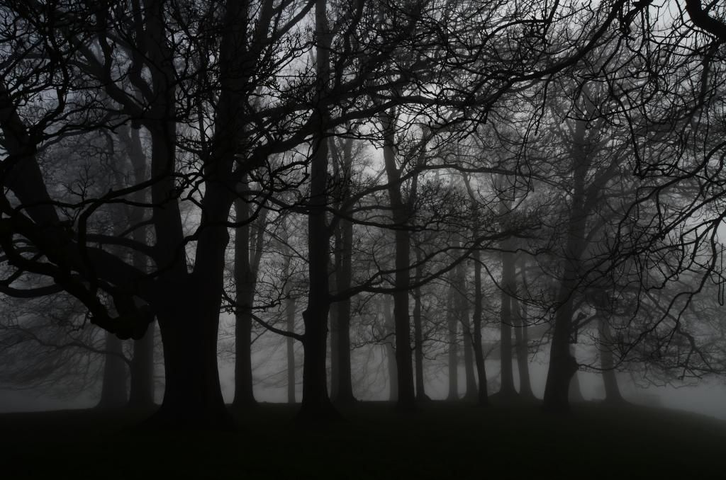
I like the shot but the branch in the upper corner and the messy portion at the left side directly troubled me. My eye also keeps being pulled to the bigger tree at the side. Contrast-wise it stands out but maybe it is positioned a bit too far to the side.
Also, why not cut it along the lines and in that strengthen them? It of course directly is a different shot but I find that when using a format aligned with the direction of the subject, it often makes a stronger shot.
Something like this:

It's a matter of taste however.
Also, why not cut it along the lines and in that strengthen them? It of course directly is a different shot but I find that when using a format aligned with the direction of the subject, it often makes a stronger shot.
Something like this:
It's a matter of taste however.
") Thats really a cool shot. Not sure which orientation I prefer, but I agree about the sides on the original are a tad to messy.
Thats really a cool shot. Not sure which orientation I prefer, but I agree about the sides on the original are a tad to messy.PatrickDeBie
Senior Member
I agree with J-see. The big tree on the left is pulling my eyes towards it so the rest is a bit ignored. I prefer the example he has given you.