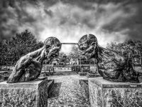
The clash

J-see

Senior Member
B&W was my first love although I got distracted with the macro. Since the season of the great dying has started and dead bugs are only fun that long, I let the macro hibernate and go back to B&W. Cold gray and rainy days have always been great for the B&W shots I prefer.

I already posted an unfinished version of this one and it's my second attempt at the statue. Evidently, it went through plenty of processing. I like this kind of drama but have no clue how others see it or what they think of the shot as a whole. Shoot, I got steel skin. ;)


368-Edit.jpg
 

Attachments

  • 368-Edit.jpg
    368-Edit.jpg
    218.3 KB · Views: 86

jazzjunkie

Senior Member
tricky one because I feel this pic has been a labour of love for you, I've looked at the pic properly a few times, but as no one else has had a go I'll give it a shot...

Composition is well placed, the symmetry of the figures is good, a little tighter on the right figure than the left, but it doesn't distract the eye. I like the heavily structured look (my boat pics are an example of how much) and the contrast suits the subject well, you can see the intricacies of the carving and the expressions of the faces well. The sky gives the scene a dramatic edge (though I do like the softer sky in your unfinished version too). I didn't like the mid ground for a while, I'd have rathered the house wasn't there, but after really seeing it a few times it has grown on me. I can't really find a fault, only if i was being really picky the white oblong on the right statue's plinth catches the eye slightly, but it's a minor thing really considering the overall impact of the pic and the work you have put in.

It's a great shot, striking, dramatic, I like it
 

J-see

Senior Member
tricky one because I feel this pic has been a labour of love for you, I've looked at the pic properly a few times, but as no one else has had a go I'll give it a shot...

Composition is well placed, the symmetry of the figures is good, a little tighter on the right figure than the left, but it doesn't distract the eye. I like the heavily structured look (my boat pics are an example of how much) and the contrast suits the subject well, you can see the intricacies of the carving and the expressions of the faces well. The sky gives the scene a dramatic edge (though I do like the softer sky in your unfinished version too). I didn't like the mid ground for a while, I'd have rathered the house wasn't there, but after really seeing it a few times it has grown on me. I can't really find a fault, only if i was being really picky the white oblong on the right statue's plinth catches the eye slightly, but it's a minor thing really considering the overall impact of the pic and the work you have put in.

It's a great shot, striking, dramatic, I like it

Thanks for the evaluation. I have a tendency to overdramatize a shot and frequently bring it back down after some time has passed. It's usually hard for me to resist the urge to go that step further.

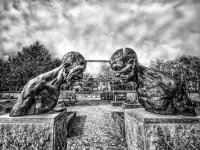
I think you are right about the sky and the whole is better after lightening that up a bit. I adjusted the white oblong and darkened it. I assume what you meant was that small square.

This is the adjusted version following your advice:

368-Edit.jpg
 
Top