You are using an out of date browser. It may not display this or other websites correctly.
You should upgrade or use an alternative browser.
You should upgrade or use an alternative browser.
Laying bare my naked soul...
- Thread starter Carolina Photo Guy
- Start date
Browncoat
Senior Member
Glad to see you're enjoying the new D3100, Pete! A couple suggestions:
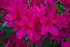
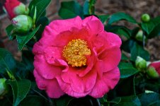
1) Color. Anytime you venture into this end of the color spectrum (ultraviolet), less is more. Because the color is so vivid and intense, it can be almost distracting to look at if there is too much of it. About 70% of this image is filled with some pretty intense color. I think it needs toned down a bit.
2) Composition. There's a lot going on here. I don't see a single focal point, there's nothing that draws my eye towards the center or around the image. For lack of a better term, the composition is too "busy".
Suggestions for next time: Find a single flower of this color and photograph it against a dark background. I think you'll be pleased with the results!
Carolina Photo Guy
Senior Member
Joseph Bautsch
New member
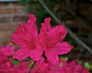
In addition to what Anthony said you need to increase the depth of field. Some parts of the flower petals in the foreground are out of focus while other parts in the background are also out of focus. That can work well if as, Anthony said, you focused on one flower and all of it was in focus. The use of depth of field can make an ordinary shot a great one but it can also make a great shot look less than ordinary. The second shot is exactly what you needed to do but with out the brick wall and the green stick running through it in the background.
Last edited:
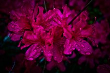
Pete, hope you don't mind. This is my version of your shot. What do you think? Better? Worse?
View attachment 2490
View attachment 2490
Carolina Photo Guy
Senior Member
Jack, Helene. I have already said y'all can do whatever you want with my photos.
Jack. I like the shape but the color seems to be too light to me.
Helene, I like the color but I do have one question.
Is that Apple Cider Vignette?
Pete
Jack. I like the shape but the color seems to be too light to me.
Helene, I like the color but I do have one question.
Is that Apple Cider Vignette?
Pete
Well, for my taste, I just think there is too much color, not enough white reflection from the water drops. I find this a little aggressive and my eyes just don't want to stick to the picture.
So I gave it a trial with B+W and this is it:
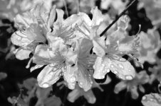
I still find there is no focal point where the eyes can rest and enjoy. But I like to see this in black and white more than in color.
This is just my opinion and in no way do I think that my take is better than anyone else.
So I gave it a trial with B+W and this is it:

I still find there is no focal point where the eyes can rest and enjoy. But I like to see this in black and white more than in color.
This is just my opinion and in no way do I think that my take is better than anyone else.
Browncoat
Senior Member
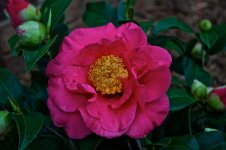
Pardon the lack of sharpness here. I had the wrong lens attached for this type of shot, but saw this pretty flower and took a photo anyway because I was out and about. This was taken with a 70-200mm up close, so there is some noticeable blur near the edges of the petals.
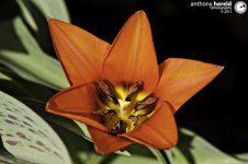
A general rule of composition is having equal positive and negative space. Here, we have filled up the center of this photo with a bright flower so it stands to reason that the background should be both out of focus and of subdued color.

A general rule of composition is having equal positive and negative space. Here, we have filled up the center of this photo with a bright flower so it stands to reason that the background should be both out of focus and of subdued color.
Carolina Photo Guy
Senior Member
The composition is much better Pete, but the exposure seems to be quite a bit under. Did you check your histogram? What metering setting are you using?
Carolina Photo Guy
Senior Member
I probably did the darkening in post. I just noticed that my overhead light really brightens up my monitor.
After I turned the overhead off, I saw just how dark the picture really is.
I will be changing that in a few minutes.
Pete
After I turned the overhead off, I saw just how dark the picture really is.
I will be changing that in a few minutes.
Pete

