first baby shoot,how do they look

pictaker64

Senior Member
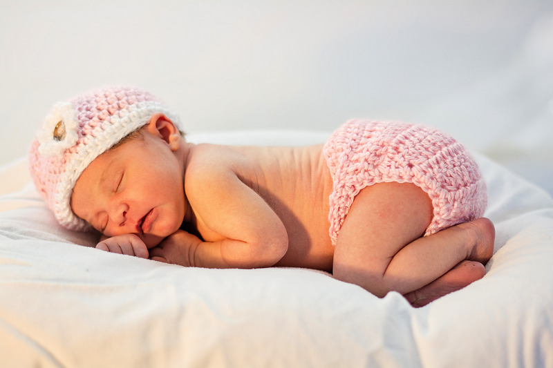
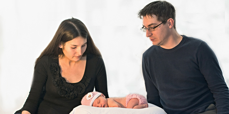
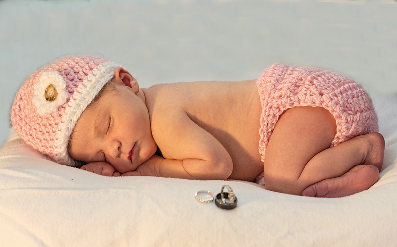
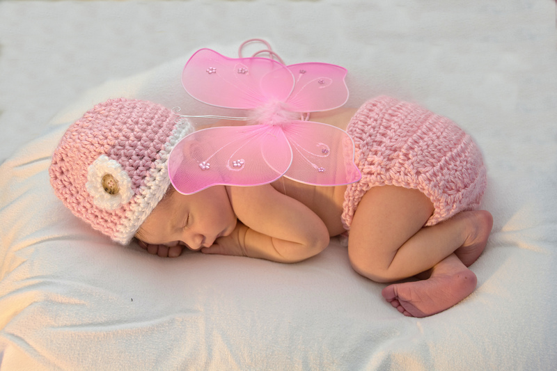
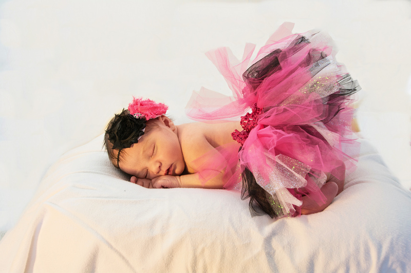
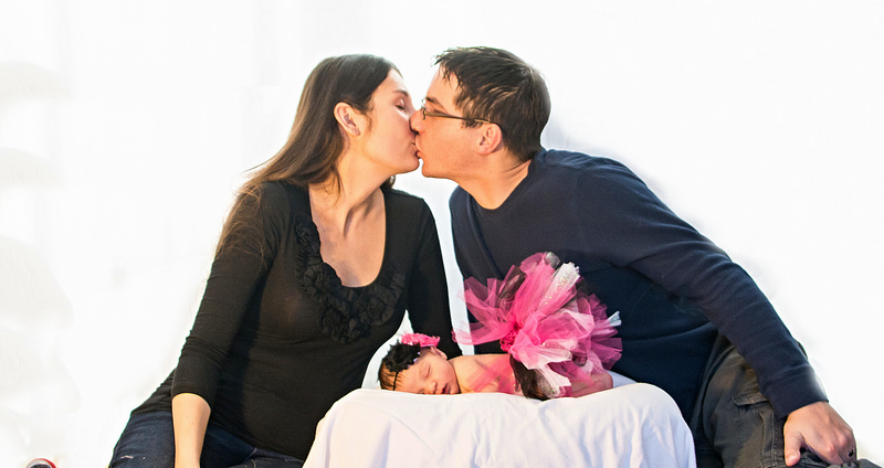
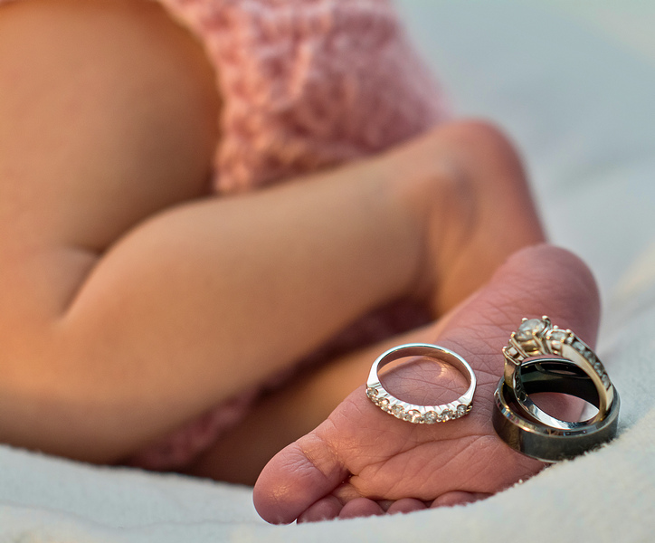
Would love some opinions from you all,I have never done portraits so its a little unsettling for me,I have lots to edit so will post more when I can.We tried some props and such some worked others didnt.A fussy baby didnt help but my Niece worked through it.Lighting wasnt the best,and I didnt want to use flash so most of these were shot with low iso and 10-50th of a second,some handheld some tripod
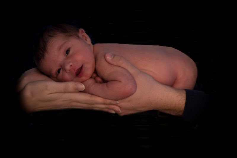
_DSC3646.jpg


_DSC3698.jpg
_DSC3724.jpg
_DSC3735.jpg
_DSC3760.jpg
_DSC3800.jpg
_DSC3815.jpg
_DSC3838.jpg
 

Marcel

Happily retired
Staff member
Super Mod
To me, only the first one would pass. The others, well, I'm not too fond of the accessories as I think they remove from the main subject who is the actual baby. The creases in the fabric don't help either and the rings... well, I don't see what they add to the shot. But, hey, I'm not the baby's parents and for them it might be the pics they prefer.

This is only my personal opinion so I hope others will give theirs as well.
 

FastGlass

Senior Member
The first shot needs to be cropped. The mans sleeve is a little distracting. His skin should have faded into darkness much like hers does. I agree with Marcel. Not much for the cutsie props and the wrinkles. They do take away from the subject. I understand your concern on the lighting but the shots have an orange glow from whatever lighting there was. Almost like she's next to a window and the sun is just coming up. Good start.
 

Scott Murray

Senior Member
They look good, and I think with some post processing they could be great. I do not think the orangish light works well for babies. Also with the first one try using a feather of 5-10% when adding black as this will take away the jagged edges. I also find the shadows quite harsh for a baby shoot. But this is just me ;-)
 

pictaker64

Senior Member
Thank you all for the comments.The Baby is slightly jaundice,so I guess I never even thought about lightening the glow.I did a quick edit on the second pic,ironed out the wrinkles(I thought it gave it depth,but again,I am no portrait taker)and raised the exposure,coupled with the contrast to give a better light..The props were my Nieces,Thats what you get when they check out pinterest.LOL...Marcel,do you think its any better now? and again thanks to everybody for chiming in,and any comments are extremely welcome,I cant learn if I dont listen,although I will never be paid for my pictaking,I still want to give the best I can at it.I will post others when I get a second,accountant day for taxes,so my time is limited...

_DSC3698.jpg
 

carguy

Senior Member
They look good, and I think with some post processing they could be great. I do not think the orangish light works well for babies. Also with the first one try using a feather of 5-10% when adding black as this will take away the jagged edges. I also find the shadows quite harsh for a baby shoot. But this is just me ;-)

I agree with Scott. With some post processing in Lightroom these could really pop.

you can handle the skin/jaundice with LR as well by your own adjustments or with presets from a place like MCP.
 

Marcel

Happily retired
Staff member
Super Mod
Thank you all for the comments.The Baby is slightly jaundice,so I guess I never even thought about lightening the glow.I did a quick edit on the second pic,ironed out the wrinkles(I thought it gave it depth,but again,I am no portrait taker)and raised the exposure,coupled with the contrast to give a better light..The props were my Nieces,Thats what you get when they check out pinterest.LOL...Marcel,do you think its any better now? and again thanks to everybody for chiming in,and any comments are extremely welcome,I cant learn if I dont listen,although I will never be paid for my pictaking,I still want to give the best I can at it.I will post others when I get a second,accountant day for taxes,so my time is limited...

View attachment 74803

Ii find it better for the foreground and background, but the baby is a little flat and bright and she/he (hard to tell) lacks saturation. But it's way better than the first one you posted. Take your time, do many versions until you get what you really like. My opinion is only valid for my pics and my taste. You have to cultivate your's and stay personal to get your own style.
 

DraganDL

Senior Member
Compositions are good, but there is a yellow/rose tint all over them. White balance problem?
Colder gamut and added contrast would make it look a little better, I think:
Untitled.jpg
 
Top