Website critique

eurotrash

Senior Member
So my site has been live for about a month now and I haven't really been shooting much during the winter.

I would like some critique on the site in general. I feel as if it doesn't have a clear pinpointed objective, partly because I don't have many photos to post there, and partly because my hands have been in many different pots as far as paid gigs go. Anyways, I welcome some input on the site.

Be nice!

Andrew Politano Photography
 

wev

Senior Member
Contributor
I waited the standard three minutes for it to finish loading -- it did not and I left. Do you have a large image or some sort of script loading on the home page?
 

ShootRaw

Senior Member
Looks great..Only thing I would suggest is which direction do you want to take this? I feel like you have to choose one or 2 genres that fit toghether..Like I specialize in Families/Children Portraits.
You have landscape/portraits/commercial construction. That is not showing which photography you are specializing in.(In a sense) Make sure what you are representing convey's to your audience and potential client. I would choose something and run with it..
 

WhiteLight

Senior Member
I waited the standard three minutes for it to finish loading -- it did not and I left. Do you have a large image or some sort of script loading on the home page?

Were you waiting for the home page to load & start scrolling?
i did :)
then i realized you just click on any image to start moving the scroll bar..

Andrew, some of the images in your gallery do not open full size.. they seem to be small pics which can't be clicked..is that how it's intended?
i would suggest you make the overall design of the site a bit more modular as i wasn't very sure where to go & what to do..

but you've taken the first big step by starting a website..
i know how difficult it can be.. i took forever to get mine going...
but that's the important step.. you can work on it to make it a perfect :)

good luck
 
IT loaded just fine for me but you failed to tell me on the main page where you are. That is my pet peeve. Also search engines tend to put more weight on the main page.
I want to see what you do and where you do it without having to dig for the information. Also you list pricing as a main page and then tell me to write to you. Better to not use the word pricing at all. Just say for more information and booking write to [email protected] or call 555-1234
 

eurotrash

Senior Member
GREAT, thanks everyone for chiming in so far!

I know, the page is a bit haphazard at the moment. I'm not sure why some pictures aren't displaying full size, I'll look into that.
I'll also make it more concise as to what/where I am/do.

The page layout IS a little strange with the scrolling, do any of you experience wicked fast scrolling, to the point where you 'overscroll' past an image of interest by any chance?
 

eurotrash

Senior Member
I waited the standard three minutes for it to finish loading -- it did not and I left. Do you have a large image or some sort of script loading on the home page?


What browser are you using, out of curiosity?

Also, from what I've tested already, it's really adept at displaying on mobile devices because of the scrolling nature of the home page.
 

eurotrash

Senior Member
I'll look into the scripts and see what's up. Safari is experiencing some slower than usual load times on my end as well today, not sure what the culprit is.. Chrome seems to be working as expected.

There aren't any larger than normal applets or anything that are loading as you access the domain, so I'm not quite sure at the moment..
 
Firefox (latest build) on dsl

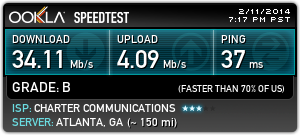
dsl can be pretty slow sometimes. Test you speed Speedtest.net by Ookla - The Global Broadband Speed Test

3300217886.png
 

wev

Senior Member
Contributor
I did first thing; normal for a SoCal line: 1.5mb; .5mb; 27ms -- but you design for the slowest, not the fastest.
 
I did first thing; normal for a SoCal line: 1.5mb; .5mb; 27ms -- but you design for the slowest, not the fastest.

that is what you should do but some many people don't realize that fact. they have a fast connection like I do and they design for themselves.
1.5 mb is pretty slow for today's internet so you are going to have some delays in loading. At 34 on wireless mine is pretty fast. My Desktop is hard lined into the modem so it is faster. I click on a site and it is loaded.

I would bet that the way this site is built the scrolling photos are going to slow you down.
@eurotrash, how big are these photos? file size? You can speed up the site by making sure the photos are 72ppi which is all the web is going to see anyway. Get them as small as you can without losing quality.
 

FastGlass

Senior Member
To me the main page is a bit confusing. To much empty space to the left. Clicking on "about me" would have thought a photo of you're self would be nice. But like other posts have said. You took the plunge and congrad. Build off what others have suggested.
 

everprentice

Senior Member
I find your slideshow cluttered. You have a mix of portraits, landscapes the construction areas. I have learned (from an article I think) that you post photos you want to sell. I suggest not putting your industrial photos in the main page. Then figure out what you want more to show: landscapes or portraits. They are both good but if you are trying to sell yourself as a portrait photographer, then portraits should be the only photos in that page. I see photographers divide their site too. They have portrait/wedding/event sites and travel/landscapes/others in a separate site. My two cents worth.

In addition, I see you are using wordpress. Make use of a gallery that you can tile so all the photos in your page are arranged well. It would also be nice if your main page slider would autoplay so we don't have to click through each of them. Sort your photos too. Example, you have mixed family portraits with a sexy pinup photo.

Finally, you have uploaded full resolution images. You can resize them to make them load faster.

Good luck!
 
Last edited:

eurotrash

Senior Member
To me the main page is a bit confusing. To much empty space to the left. Clicking on "about me" would have thought a photo of you're self would be nice. But like other posts have said. You took the plunge and congrad. Build off what others have suggested.


Yes, working on getting a photo in there actually.

To whomever asked how large the files were, they're limited to 5MB for the upload process and compressed further than that when displaying on the page. How MUCH further is a mystery, but they shouldn't be more than about 3.5MB I would think.

The idea for the main page is really geared towards mobile platforms since a lot of my current clients (and probably future ones as well) will be handed a business card and immediately go on their phones to see the page. When I think about it, that's really how the majority of my age bracket/clientele has accessed it in the past so I made it a little more friendly on that front at the expense of desktop compatibility.

It's not much of a 'defense', but it's the truth ;p
 
Top