First gig-senior portraits

Toddw

Senior Member
Keep in mind that this is just a hobby that I enjoy doing and am still learning alot. I took these with my second camera, a D7000, and either a 35mm 1.8G or a 50mm 1.8G. They are of a girl from my Church who saw some pics I did of VBS and asked me to do her senior portraits, I think mainly because a real photographer is not in their budget. Give me some honest feedback on what I should have done differently.
 

Attachments

  • Maegan guitar.jpg
    Maegan guitar.jpg
    65.2 KB · Views: 166
  • Maegan horse.jpg
    Maegan horse.jpg
    77.8 KB · Views: 176
  • Maegan pong.jpg
    Maegan pong.jpg
    88.6 KB · Views: 164
  • Maegan RR.jpg
    Maegan RR.jpg
    77.2 KB · Views: 197

hark

Administrator
Staff member
Super Mod
Nice job! First of all, the forum rules only allow one photo per thread so don't be surprised when a mod jumps in here.

I like the first photo but would prefer to see it cropped by removing the left side of the photo and cropping tight to her hair.

The 2nd photo (horse), I would prefer not having a tree coming out of the horse's back. Perhaps it can be cropped?

The 3rd photo I'd like to see her from the other end of the guitar but at more of an angle than how you did the first photo. Seeing her face is important as well as one or both of her hands. If you are going to take her photo from this end of the guitar, I'd like to see her face much closer and the fingers on the strings. If you are going to include that much background, can you use a wider aperture to blur more of the background?

​The 4th photo is my favorite! If her fingers/hand would have been more relaxed, that would have made it nicer, but other than that, I really like this one! :)
 

Mike D90

Senior Member
Take this as just what it is, thoughts of another newbie to digital.

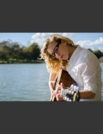
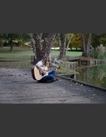
The first photo of her with her guitar I would have taken portrait orientation, or cropped tall instead of wide. The second one with her and her guitar I would have cropped a little closer with a little better better composition (rule of thirds). Also, that large tree directly behind her head bothers me a little too.

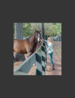
The one with her petting the horse, much closer crop and probably a taller crop instead of wide. I personally don't want to see more of the horses body than its eyes and face and maybe a shoulder. The horse takes up more of the photo than that of the subject (the girl) and, to me, that detracts focus from the girl.

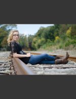
The one with her sitting at the tracks is good but, again, I would have included more sky and less foreground I think. Maybe taken from a different angle and show the tracks trailing off in blurred bokeh.
 
Last edited:

Toddw

Senior Member
I failed to mention that I didn't charge for the job. Also I did use Lightroom 5 to edit them.
I wasn't aware of the 1 photo forum rule. I'll remember that in the future and I apologize to the mods.
Thanks for the input so far. Hark, I didn't even notice her hand but I see now what you mean and it bothers me now too. I did go back and crop out the tree behind the horse as it did look odd after you mentioned it. Mike, that tree behind Maegan's head on the bridge with the guitar bothers me now too. I'm trying to learn to analyze the composition when I shoot so I won't look back later and want to change so much, not being able to.
 
Last edited:

Mike D90

Senior Member
If possible, crop the originals again and post them once pic per critique thread (as per rules) and see what a difference it might make.
 

Ruidoso Bill

Senior Member
I like the fact that you got her to pose doing things she is interested and enjoys, that's is so important in relaying what is important to her.

Over all I would have shot them a lot closer, that main goal of the portait shoot is to show here face. For example the horse petting, imho would have been better showing her face closer to the horses face but the faces dominating the frame.

Nice clear focus and good exposure, keep up the good work and thanks for sharing.
 

Mike D90

Senior Member
Mike, that tree behind Maegan's head on the bridge with the guitar bothers me now too. I'm trying to learn to analyze the composition when I shoot so I won't look back later and want to change so much, not being able to.

I find this a good approach too. I learn every time I shoot.

What I personally do is kind of compartmentalize my shot:

I do this in this order:

- I look at the available light. The type, the amount and the color of it.
- I look at the background and foreground and try to visually set up the composition around what is there that cannot move or be moved.
- I look for color, or things with color, and compare them with my subject to see if they are a distraction or compliment
- I look for the most interesting angle(s) to shoot from
- I then pose the subject or try to find the best pose or profile and then check everything inside my viewfinder
- I then compose the shot
 

Tami Jo

Senior Member
I really like the 4th shot. Its a fun shot and draws attention to her face. The 1st one is nice also, maybe cropping a bit would make it even better. Which did your client prefer?

sent from my galaxy tab 2
 

Toddw

Senior Member
These are 4 of 56 different shots, I just liked these the most. As for the client, she hasn't seen them yet. I'm going to add text to a few, "Class of 2014" so they aren't quite done yet. I'm also going to figure out a way of presenting them that might create the wow effect.
Sent from my KFTT using Tapatalk 2
 

Mike D90

Senior Member
I'm also going to figure out a way of presenting them that might create the wow effect.
Sent from my KFTT using Tapatalk 2

What method are you going to use to present them? Web or on digital storage or actual prints?

If displaying on the web or by digital album, try building some "frames" in Photoshop or another program. You will see many of the folks here that post their shots "framed" by a border constructed by an image editing program.

This is just a quick sample of what I am talking about.


Maegan_with_guitar.jpg
 

fotojack

Senior Member
My personal favourite is the 4th one, of the girl on the tracks. The rest need work. The main idea of a portrait is to show the face of the main subject. It doesn't necessarily have to be looking at the camera, but you should at least SEE the face.
All good advice from the other members, too. :)
 
Top