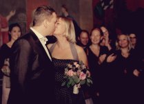
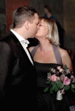
Which processing for this image

wud

Senior Member
I do know I have spammed you a lot with wedding pictures, I'll stop very soon ;)For those who havent seen it (in my own thread), I did some pictures in a very dark room and I'm only learning how to use my blitz. So these didn't really come of, as I wanted.

Ended up with 3 different editing styles, could you help and let me know, which is the best?
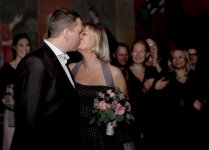
randi_5262 copy2 copy.jpg
randi_5262 copy2 copy2.jpg
randi_5262 copy2 copy 3.jpg
 

Rick M

Senior Member
I like the middle one, but I would crop some of the right side off, maybe 8x10 instead of the 6x9. Even though they are in the background, the two women to the right have too many harsh shadows to deal with, not a pleasing blur.
 

wud

Senior Member
If you don't know Blitz - it means flash :cool: It seems Danish is like German too

For me goes this one - great warm photo

View attachment 53252


Lol, yes, I mean flash.
Maybe a little less warm?

I like the middle one, but I would crop some of the right side off, maybe 8x10 instead of the 6x9. Even though they are in the background, the two women to the right have too many harsh shadows to deal with, not a pleasing blur.

I know! And think you and Horoscope Fish are right, gotta get them out of the picture.


Horoscope Fish

Senior Member
I cropped it vertically. Hard... And removed a head. It just depends on what you're after with the shot, of course...
 

Attachments

  • 53241d1379801301-processing-image-randi_5262-copy2-copy.jpg
    53241d1379801301-processing-image-randi_5262-copy2-copy.jpg
    200.7 KB · Views: 103

Horoscope Fish

Senior Member
That looks so much better, think thats how I gotta do it. Maybe start from scratch again, with this cropping in mind.
I thought there were too many other faces pulling my attention away from what I think, really, is a very simple, very intimate moment between just THOSE two people.

Just my thoughts on the matter. Glad you like it!
 

Rick M

Senior Member
I agree, I think the on-lookers may have created a different feel had they came out better, but Horescope has shown you can make it private and still have a nice shot. I do like what I believe was the original theme, it just didn't get the right lighting/blur. What lens did you use?
 

wud

Senior Member
I agree, I think the on-lookers may have created a different feel had they came out better, but Horescope has shown you can make it private and still have a nice shot. I do like what I believe was the original theme, it just didn't get the right lighting/blur. What lens did you use?

The 35mm, I don't dare to use the 50mm, as it seems it sometimes doesn't focus properly. And the rooms are way to small to use my 70-200mm. So, 35mm it was.


This is from today, also 35mm. Proper lighting and no flash:

lisbeth_bryllup_5767_web.jpg
 
Last edited by a moderator:

Moab Man

Senior Member
#1 for me. The finish of the others looks like a fog or haze to me.

Funny you mention the 50mm. There is a thread going on about the 50mm and its focus and or lack of reliability to nail it consistently.
 
Last edited:

PapaST

Senior Member
I like number #1. The colors are more to my liking with the first. It's a shame to have to crop out the audience because although it is an intimate moment. I think it's also important to show everyone celebrating their union. Like Horoscope said... it depends on what you're looking for.
 

rocketman122

Senior Member
color wise, #1. 2 is meh. and 3rd is too warm for my eyes. but #1 needs a bit of warmth. a smidge. but not like #3.

I liked the landscape shot MUCH better because the people in the back give a nice feel of what was happening. this isnt a portrait session where it would only be the BG. the feel of the people in the background is what I think makes it better. it gives a nice feel to the picture. the lighting is harsh and in a portrait session the lighting would be better quality so no, leave it as it is. dont crop. even when I look at the photo it makes me smile and want to be there and celebrate with them. and I can feel what it would be like being there. you dont get that in the crop.

if you crop then its neither here nor there because in their portrait session the lighting has to be better and here its ok but not stellar. the people in the background just brings it up another notch.
 

wud

Senior Member
I ended up with these, and a few more. Not truly happy about them, I would have liked to nail the images in the camera, I think it shows, that I didn't.. I really dont hope I'll be spending a lot of time in this room, its such a difficult place :)


randi_5258_web.jpg


randi_5254_web.jpg


randi_5265_web.jpg


randi_5262_web.jpg


randi_5275_web.jpg


Top