What's wrong/How can they be improved?

Slipperman

Senior Member
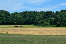
this first one i've always liked but i've received comments that make me think it could be improved. one mentioned it looked too hazy and had too much of a yellowish tint. as far as the haze, it was not a particularly hazy day when i snapped it as you can tell by the blue sky (i've taken pics on hazy days before and when its bad, you can't even see the blue). he may have a point about the yellow but at the same time, there is a lot of dirt and dead grass in the pic that could be affecting their/my perception. it was well lit and well exposed so i'm not sure what else i could have done. when i tried boosting the color in ViewNX it came out looking too watercolor-y.
another comment implied it would have been better if the tractor was further over to the right so that it looked like it was entering the frame as opposed to where it is (to the left) where it looks like its leaving the frame. this may be valid to a certain extent but what hobbyist really thinks about that? especially when i don't own the farm and therefore have no control over the position of the tractor.
anyway, here's the pic..


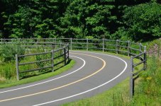
this one i just took recently and was just wondering what you thought..


Bill16

Senior Member
I don't see the haze you mentioned, but a little increase in saturation of color might make it pop more. In the second shot the stop sign draws your eyes to it, and seems that makes it seem slightly out of focus to me. But I could be wrong. Cool shots! :D
 

480sparky

Senior Member
With a bit of effort, you can mirror the tractor & implement around so they're faced the other direction. It could be improved by working with the Curves & black/white points a bit.

The second one.... no subject.... Lots of lines leading all over, but to nowhere.
 

Horoscope Fish

Senior Member
this first one i've always liked but i've received comments that make me think it could be improved. one mentioned it looked too hazy and had too much of a yellowish tint.
I agree the color balance is off a little bit. Nothing drastic, but yeah, it's a little yellow. A little hazy at the tree line, too.


another comment implied it would have been better if the tractor was further over to the right so that it looked like it was entering the frame as opposed to where it is (to the left) where it looks like its leaving the frame. this may be valid to a certain extent but what hobbyist really thinks about that? especially when i don't own the farm and therefore have no control over the position of the tractor.
Well if you're asking feedback about the composition of this shot then I would think about that; it's a pretty basic compositional tool.


The second one.... no subject.... Lots of lines leading all over, but to nowhere.
Agreed. Lots of elements but no clearly defined subject. There's potential with leading lines but as it is, they take us nowhere.
 

Bill16

Senior Member
Oh your right! Now I see it. Just goes to show I have a lot to learn! Lol :D
I agree the color balance is off a little bit. Nothing drastic, but yeah, it's a little yellow. A little hazy at the tree line, too.


Well if you're asking feedback about the composition of this shot then I would think about that; it's a pretty basic compositional tool.


Agreed. Lots of elements but no clearly defined subject. There's potential with leading lines but as it is, they take us nowhere.
 

480sparky

Senior Member
I did a quick-n-dirty edit. Took all of 2 minutes. I also adjusted the white & black points, put a slight S into the curve, and edited out the distracting gray roof in the trees.

9338008498_4ca751b8c8_d.jpg
 

Slipperman

Senior Member
I did a quick-n-dirty edit. Took all of 2 minutes. I also adjusted the white & black points, put a slight S into the curve, and edited out the distracting gray roof in the trees.
this looks similar to the color boosting i did in ViewNX but i thought mine came out looking a little unnatural. of course i didn't remove the haze or play with the curve at all.
this one has a slightly different exposure and is probably the one i should have chosen to post. looks better after applying some sharpening, shadow protection and D-lighting in ViewNX (no color boost)..

Farm_ 001_2000.jpg
 

480sparky

Senior Member
this looks similar to the color boosting i did in ViewNX but i thought mine came out looking a little unnatural. of course i didn't remove the haze or play with the curve at all.
this one has a slightly different exposure and is probably the one i should have chosen to post. looks better after applying some sharpening, shadow protection and D-lighting in ViewNX (no color boost)..

View attachment 47457


Since ViewNX has no Curves function, you really can't do the same thing with it.
 

Slipperman

Senior Member
curious about this one too (don't worry - i'm not gonna post my entire catalog)..

Matta_Hunter_ 109_new.jpg

there's leading lines (literally) but they start off to the side instead of from the viewers perspective (front).
 
Last edited:

Slipperman

Senior Member
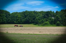
tried this one again. i first sharpened it in ViewNX and did the rest in Lightroom (LR's sharpening seems to mush the details of the leaves together). basically just turned up the saturation for R G and B, turned down the saturation for Y and added a little vignetting. i still don't notice the haze but at least it looks less yellow with the other colors more pronounced.

Farm_ 010_new-2.jpg
 
Top