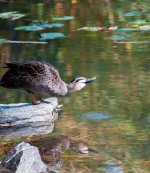
Pacific Black Duck

Screen Hit

New member
Happy for critique on this little fellow. I turned around from shooting some other ducks and quickly got off three shots and these two are the best of the three.

I am aware that the head is slighly out of focus but I love the stance on this one.
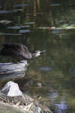
Duck3_0179-3.jpg

Pacific Black Duck was taken 06/09/10 at the Brisbane Botanical Gardens using:
- Nikon D90, 1/250sec @f5.6, lens 55-200mm at 200mm, ISO 200
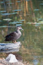
Duck 2-3.jpg

Pacific Black Duck was taken 06/09/10 at the Brisbane Botanical Gardens using:
- Nikon D90, 1/125sec @f5.6, lens 55-200mm at 200mm, ISO 200
 

ohkphoto

Snow White
I am aware that the head is slighly out of focus but I love the stance on this one.

I do, too, and would work with this one.

What software are you using for post-processing?

1. Try cropping out the bottom just below the reflection . . . you can try to bring out the reflection a little more which would add to the pic. You want your main subject to not be smack in the middle of the picture (unless you are specifically breaking the "rule of thirds" for artistic reasons)
2. The bright rock in the foreground detracts from the duck. If you want to keep the reflection, tone down the exposure on the rock (e..g. adjustment brush in lightroom) Otherwise crop it out (or photoshop it out).
3. Colors should be little more vibrant --try the tone curve and vibrance slider in lightroom if you're using it.
4. Sharpen and up the clarity.

A lot can be done for this photo with the right post-processing. I think it's a great capture (I love ducks!) and is worth working it to your liking.

Best Regards
 

Screen Hit

New member
Thanks Helene,

Sorry forgot to put the post- processing in I have both Lightroom 3.2 and Photoshop CS5.
I am more confident using Lightroom at the moment as I am only learning how to use Abode Bridge/Photoshop CS5.

I'm afraid work is going to interfer today so I'll certainly try out your ideas tonight thank you.
 

ohkphoto

Snow White
I'm afraid work is going to interfer today

I know the feeling.

Welcome to the forum, by the way. I think I might have missed welcoming you in the new member thread. . . (got behind, because of work . . . sigh . . .)

Good for you for jumping right in and posting to the critique section!

Best Regards
 

Joseph Bautsch

New member
Screen Hit, Good you got it in the critique forum. My thoughts on this one, picture number one, can be achieved in Lightroom 3 without CS5. As has been suggested by Helene, I would use the brushes in Lightroom and burn in the rock on the lower left, making it darker,. The bright rock is distracting. By making it darker you take a lot of the distraction away. I would also burn in the light colored lilly pads in the upper right. Same reasoning. The brightness distracts from the duck. Once that is done I would, as Helene recommended, crop from the bottom up to just below the ducks reflection and place the burned in rock sitting on the bottom of the framing. A darkened rock sitting on the bottom of the frame will be a lot less distracting. I would crop the top down to the lilly pads and a little off the right (not much). The cropping should provide the composition balance. Apply the rule of thirds, the top third, the pond and lilly pads, the middle third the duck and the rock he is standing on, and the bottom third his reflection and the darkened rock. How bright and vibrant you want the colors is often a matter of choice. Helene likes them brighter and more vibrant and in this case I would agree with her. You should also sharpen it up a bit. BTW Helene very good analysis.
 
Last edited:

Screen Hit

New member
Just making sure I'm on the right path with crop and adjustments.
Duck fix 1-3.jpg

Not quite happy with colour yet but one thing at a time.

Thank you for your help so far :rolleyes:
 
Top