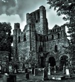
Kelso Abbey

Zulumika

New member
So here's Kelso Abbey, Scotland, Sept 2006. My wife and I have a hell of a fun wakin' around the place just the 2 of us. The grass was almost fluo green. I flipped this in B&W to recreate an old ruin feel...

Any thoughts? Thanks.
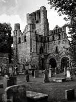
PICT1121 copy.jpg

Konica-minolta Dimage g600, 1/200s, f/4.7, iso100
Edited with Nik silver efex pro
 
Last edited:

Joseph Bautsch

New member
Great subject. The b&w does make it appear more of an old ruin. Good composition. The Abby is leaning to the left and needs to be straitened up. There are a couple of tomb stones in the foreground that are out of focus and distracting. They are too large and a little too dominating in the composition. The out of focus can be corrected with a change in depth of field. An exposure using f/11 or f/16 would probably correct that. Also the the b&w tonal range is a little flat. The clouds should be white and the shadows need more detail and not quite so dark.
 

ohkphoto

Snow White
I agree with Joseph's critique. Additionally, the figure in white (lower left side) appears to be coming out of the tombstone. It might look better with her "photoshopped" out (on the other hand, if it's your wife, you may not want to photoshop her out :). The BW is a great choice . . . really gives you a good sense of the place.
 

Browncoat

Senior Member
Forgot to add details...

I agree with what the others have already said, and will go a bit further. What you're lacking here is contrast. You need to cover the entire tonal range, meaning the must be pure black and pure white within the image, and all the shades in between. What you have now is kind of flat and gray. You're trying to convey a sense of age and looming, perhaps even a little scary. When you play in the safe middle, the image turns out kind of blah and boring. Don't be afraid to get bold and really bring out those shadows and highlights.

Crop out those tombstones in the foreground, they're taking away from your composition, as is the unwanted visitor. You might even toy with adding a vignette to this to help frame it.
 
Top