Headshot

carguy

Senior Member
Peter Hurley came to town recently and I was inspired to drag out my OCF gear. I've been talking to a few people about headshots recently and am working on my work flow.

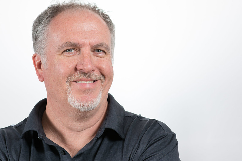
I picked up two Westcott Rapid Boxes (10" x 24" strip), had them in front at 45 degree angles.
A speedlight was behind me making the gray wall white.
Nikon D7100 & 85mm f1.8G

New lighting gear test - Westcott Rapid Boxes by Joe Lopez, on Flickr
 

Bikerbrent

Senior Member
Perhaps this is what you were testing for, but lighting is a little flat. I would reduce the flash on the right side and also crop off the right.
 

carguy

Senior Member
Perhaps this is what you were testing for, but lighting is a little flat. I would reduce the flash on the right side and also crop off the right.
I like the crop as well as full vertical headshot type crop. I do plan to add an overhead light as well, note the collar shadow.

Sent from my SM-G930V using Tapatalk
 

STM

Senior Member
The lighting here is very uniform and flat. For portraiture a 2:1 lighting ratio between the main (key) light and the fill light is preferable. Sometimes a 3:1 lighting ratio gives even better modeling and a more pleasing portrait. If you are going to get an overhead light I suggest you use it as a "hair light" to give separation from the background. You can position it camera left of right depending on where your main light is placed.

I would also say that there is too much negative space to the right of the subject. Some of that should be cropped out to provide a more balanced looking portrait.
 
Last edited:

carguy

Senior Member
The lighting here is very uniform and flat. For portraiture a 2:1 lighting ratio between the main (key) light and the fill light is preferable. Sometimes a 3:1 lighting ratio gives even better modeling and a more pleasing portrait. If you are going to get an overhead light I suggest you use it as a "hair light" to give separation from the background. You can position it camera left of right depending on where your main light is placed.

I would also say that there is too much negative space to the right of the subject. Some of that should be cropped out to provide a more balanced looking portrait.
I appreciate the feedback, I'll consider the lighting setup info as well.


Are you familiar with Peter Hurley's style of headshot/portrait photography?
 
Top