Which one is better?

SacrificeTheory

Senior Member
1 -
9413383537_93b5c60920_b.jpg


2-
9416151422_7138e054bc_b.jpg


3-
9416153768_dd78c2c7ab_b.jpg


4-
9413390675_c6cb6db78d_b.jpg


What can I improve on too?
 
Last edited:

Horoscope Fish

Senior Member
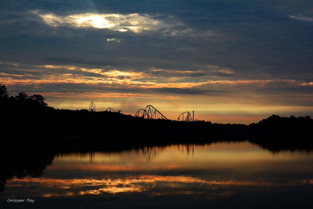
Of the four, I'd say I *like* #3 the best. This shot works best as a landscape, in my opinion.

Now, that being said, you have several *elements* in this shot but I'm not clear what your *subject* is, and this confusion detracts strongly from the images overall. You have great clouds, great water but your horizon line is dangerously close to dead center. Then too you have what appears to be a roller coaster in the background... I'm left wondering what your subject is. Figure that out and then hit me with it.
 

SacrificeTheory

Senior Member
I wanted to get both the sunrise and the reflections and fit it all in the frame. Guess by doing that it made the horizon in the center. But is that always a bad thing? Is it better for photography to not have it in the center? Also, it is a roller coaster in the background.
 

Horoscope Fish

Senior Member
I wanted to get both the sunrise and the reflections and fit it all in the frame. Guess by doing that it made the horizon in the center. But is that always a bad thing? Is it better for photography to not have it in the center? Also, it is a roller coaster in the background.
All of this is subjective so we could go round and round about whether or not it's a "good" thing or a "bad" thing. Simply put, basic rules of composition suggest you need to define a subject. Once you've defined your subject, another rule suggests putting your horizon at either the top third of your frame or the bottom third of your frame depending on what your subject is.

You can reply with, "But I like it better this way..." Okay, fine. It's your photo, do what you need to do to be happy with it and yes; there are those times when throwing out all the rules turns out a fantastic image. It's uncommon, but it definitely happens. Personally speaking I just don't happen to think this is one of those times. Just my opinion. Again, they're your pictures do what you need to be happy with them.

Here's a suggested cropping...
 

Attachments

  • 9416153768_dd78c2c7ab_b.jpg
    9416153768_dd78c2c7ab_b.jpg
    277.8 KB · Views: 87
Last edited:

WhiteLight

Senior Member
Ok.. third opinion here--
i like the first one, cos the others seem to be a little over saturated or fringed.
The first looks natural to me.. but i would also like to lighten the shadows a little to see the details & maybe increase the saturation a wee bit to see the colors
 
Top