Feedback wanted

Clovishound

Senior Member
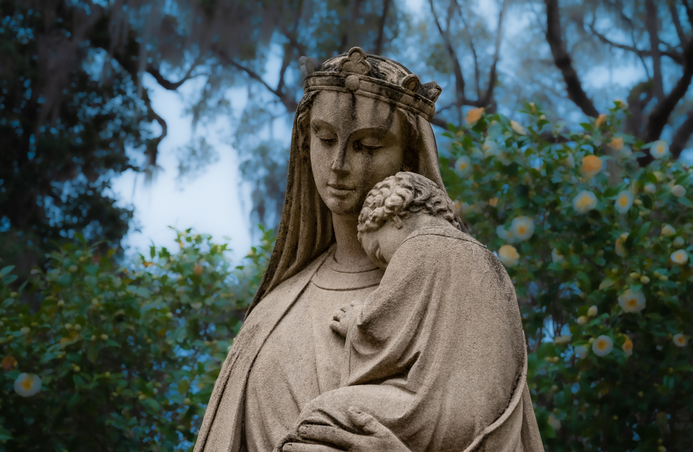
I've been going back over some photos I have on my hard drive and reworking some using techniques I have been experimenting with in Lightroom. I ran across this photo and decided to try something a little different. I am somewhat undecided about the treatment of the background. The idea was to contrast the surreal background with the realism in the subject. I like the feeling of it, but not sure the surrealistic look is appropriate. I cooled down the color temp of the background to help separate the subject and background. Thought I would post here and see what folks here thought about it.

No need to spare feelings. If you don't like it, that is valuable info for me. Letting me know why would be valuable as well. The same applies if you like it.
_DAB0967-2.jpg
 

hark

Administrator
Staff member
Super Mod
To be honest, I am not crazy about the blue haloing around the tree branches. It takes my eye away from the subject. And the subject doesn't pop off the background because both the statue and background are kind of on the darkish side. If one could be lighter than the other, it would help the statue stand out a little better. I would also lighten the face slightly since it appears darker than the rest of her body. Their faces should be the focal point in my humble opinion. There's definitely a story here though. :encouragement:
 

Peter7100

Senior Member
I like the dark branches in the background but feel the yellows and greens are a bit distracting. Hope you don't mind but I tried to see what I would have done myself and came up with this......

Lightroom changes.jpg
 

desmobob

Senior Member
I like the idea of creating some kind of contrast between the subject and background, but I feel there isn't enough separation. The face is dark and blends in to what I feel is a slightly distracting background. It does have a surreal feel, though. I think Peter's treatment is one way of making the subject stand out more.

It's a neat shot that offers some opportunities, I'd say. :encouragement:
 

Clovishound

Senior Member
To further isolate the subject, I lightened it some. I also darkened the background some, and went back to a little more blue to contrast with the warm colors in the statue. Not quite as far as Peter went with the darkening. And, no, Peter I don't mind at all that someone edits one of my photos to show me something they had in mind.

I sort of like this rendition best, although it looks like I pasted the statue from one picture onto the background of another.


_DAB0967-4.jpg
 

Bikerbrent

Senior Member
To further isolate the subject, I lightened it some. I also darkened the background some, and went back to a little more blue to contrast with the warm colors in the statue. Not quite as far as Peter went with the darkening. And, no, Peter I don't mind at all that someone edits one of my photos to show me something they had in mind.

I sort of like this rendition best, although it looks like I pasted the statue from one picture onto the background of another.


View attachment 379872

Yes, this is the best yet! :cheerful:
 

Dangerspouse

Senior Member
To further isolate the subject, I lightened it some. I also darkened the background some, and went back to a little more blue to contrast with the warm colors in the statue. Not quite as far as Peter went with the darkening. And, no, Peter I don't mind at all that someone edits one of my photos to show me something they had in mind.

I sort of like this rendition best, although it looks like I pasted the statue from one picture onto the background of another.


View attachment 379872

I have to admit, I like all the versions, even the original. This is my favorite of the bunch though.

Just for fun I tried a quick edit. Mostly I just wanted to crop it a bit to make the main subject more dramatic. But while I was in Lightroom I gave it a few tweaks in other areas for fun. I think yours is still the best, though:

Clovishound Edit (1 of 1).jpg
 

Clovishound

Senior Member
I think I ought to reshoot this when I get a chance. Hopefully, my daughter and I will be free to make some half day trips in a few months. I should be able to take some more of this statue perhaps from different angle, and maybe a few verticals.

Thanks to all for the feedback. I may try playing around with it some more.

Here's one for the artsy crowd.


_DAB0967-6.jpg
 

Needa

Senior Member
Challenge Team
What was your vision for the edit? When viewing the first photo you posted I thought fog, from the whited background. How I would have approached this based on the fog idea was to get separation I would have have sharpened and added some local contrast to the statue only. Would have made the background more like your second photo. A this point could have added some haze to the foliage to complete the fog theme. Then who knows might have scraped it and started over. :)
My take on how light or dark the statue should be what are you trying to convey daylight or after dark or something in between. Found Peters take interesting.
 

Fred Kingston

Senior Member
I would re-shoot the image... with attention to the background... The current image can't be fixed IMO without removing/changing the background drastically... The focus is the statue...the background is detracting from it... Sometimes, you can do things to the background to remove that attention/focus...but in this case, I don't think you can...
 
Top