First Try At Product Photography

BackdoorArts

Senior Member
As I mentioned a while back, a friend of mine asked if I'd be willing to do some photos of some of the work his graphic arts company has done as a part of their website revision since his regular studio guy was booked solid through the new year. I've been wanting to learn how to do this stuff, so I told him I'd take a shot at it, and if he liked the work I'd swap him for some logo work as I try to start going commercial. Love the barter system.

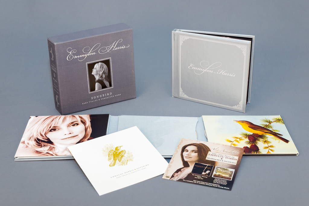
So, today was my first chance to give this a shot since I had a 3 hour conference call that required very little of my undivided attention. I used this CD box set (love me some Emmylou) since it is representative of some of the things he has on his site currently. I know that the space I shot in was too small, and the lights were probably a little close to the product, but the fill-in flash worked well, and the remaining shadows were easy to touch up in post. I had to shoot handheld because of the space issue, so I wasn't tethered and didn't spot the DoF issue that has the front edge out of focus, but that'll be fixed. And he'll be there to compose the product as he wants it.

What I'd like are you opinions on the lighting. I'm assuming some level of shadowing is normal. I've got umbrella lights from right and left, and a fill in flash bouncing on the ceiling to eliminate shadows. Is there a better way to do it without bringing in a third light or a second flash?
_D619778-Edit.jpg
 

BackdoorArts

Senior Member
I only used grey because he mentioned that he wasn't sure if he wanted white or grey, so with the test I wanted to show him that I could do grey if need be, and the shade of grey I had available in case he wanted lighter. I use this behind guitars as a nice neutral background on For Sale shots.
 
I don't think white would do much better. After looking at it again I think what bothers me is the box on the left tends to blend into the background a little to much. I do like the grey though. maybe just a little backlight to give it some separation?
 

Mfrankfort

Senior Member
Looks good. A cheap way to get good bounce could be a piece of white cardboard or a couple strategically placed reflectors. Just suggestions, as the picture is probably much better than I could do. lol
 

riverside

Senior Member
I only used grey because he mentioned that he wasn't sure if he wanted white or grey, so with the test I wanted to show him that I could do grey if need be, and the shade of grey I had available in case he wanted lighter. I use this behind guitars as a nice neutral background on For Sale shots.

My only critique would be the gray box edge touching the contents (photo) versus CD holder not touching - balance.

Could be my PC but it looks like your lighting has created several shades of gray? Background color is simple to change in post processing.
 

BackdoorArts

Senior Member
My only critique would be the gray box edge touching the contents (photo) versus CD holder not touching - balance.

Could be my PC but it looks like your lighting has created several shades of gray? Background color is simple to change in post processing.

Yeah, as I mentioned this was thrown together quickly to test whether or not I could pull off the lighting, so product composition was very hurried, just trying to get a mix of things in mixed positions, since that's what he has now, and make sure I could deal with the shadows.

You're definitely right about the shades of grey (though far less than 50 ;)) that likely resulted from my trying to eliminate what was left of the shadows in the middle. A backlight source may be the trick there - either a reflector or a second flash, which I've been debating anyway. A little more care and time spent in post wouldn't hurt either. The fabric background began to rise almost immediately after the box and cover, so a larger flat surface will help as well.

This is why we practice, right? Thanks for the suggestions.
 

BackdoorArts

Senior Member
Here's a quick shot I did before the CD set that exhibited the same issues (as you can see, light was stronger from the right at this point and I hadn't gotten the bounce flash set properly). I quickly masked, balanced and desaturated the background to remove the color cast. And in the process I learned how to copy layer masks - BONUS!!

_D619763-Edit.jpg
 

carguy

Senior Member
Nice shots right out of the gate. I agree with the comments above, but I'm not sure what you do when you have light and dark colors in the subject. I'm sure there is balance somewhere...

The second example looks good, not sure how much light reflecting off the product is considered 'acceptable'. Win/Win on the additional learning with subject #2. Interested in how this progresses :)
 

BackdoorArts

Senior Member
The second example looks good, not sure how much light reflecting off the product is considered 'acceptable'. Win/Win on the additional learning with subject #2. Interested in how this progresses :)

This was a test shot to simply check on shadows, but good point on reflectivity.
 

Browncoat

Senior Member
View attachment 55996

This stuff is difficult to photograph. Flat, semi-reflective surfaces present a lot of challenges because even if you remove the product and focus on smoothing out the lighting on just the background, adding the products into the mix will inevitably bounce your lighting all over the place. Whatever you do, don't go with a white background on this one. I think you're on the right track with the gray.

What strikes me the most here is that white page on the bottom left (with the gold bird). You can't lay white pages flat, or they're going to reflect most of the lighting from overhead and be difficult to read. I think you've got something to work with here. The biggest issue right now is product placement. That looks like a tri-fold deal with pockets, so show it off by having something sticking half out of there to show that they are in fact, pockets. Is that a CD case? Put a CD in there and let it stick out a bit.

The good news is, you should be able to find a TON of inspiration for these products online, and how they are arranged.
 

BackdoorArts

Senior Member
Thanks, Browncoat. As I mentioned, the placement is something that my friend/customer will be working with me on, so we'll be able to get it the way he wants it and the way that shows it off best. Looking at his current site the product is all very stark and flat, so I'm not sure if he's looking for something different or just a newer, larger set of images since his site hasn't been redesigned in 3 years. Truthfully, I'm not sure that he knows, which is both good and bad since we can see what works and what doesn't with what he wants shot.
 

Browncoat

Senior Member
How committed is this guy to updating his catalog? Committed enough to do special runs on non-glossy paper?
​That would make your job a helluva lot easier. Might be something to run by him.
 

BackdoorArts

Senior Member
How committed is this guy to updating his catalog? Committed enough to do special runs on non-glossy paper?
​That would make your job a helluva lot easier. Might be something to run by him.

It's capturing work that he has accumulated over the course of 8 years in business. No special runs. A lot of it is on semi-gloss and matte, so we should be OK. I'll be sure to post actual work.
 
Top