You are using an out of date browser. It may not display this or other websites correctly.
You should upgrade or use an alternative browser.
You should upgrade or use an alternative browser.
Winter landscape photo
- Thread starter premc44
- Start date
Joseph Bautsch
New member
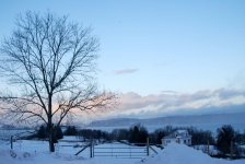
Good exposure. The blue cast imparts a feeling of cold. There are a number of different composition elements competing to be the central subject. This leads the eye from one element to the next with out rhyme or reason. It's not tied together. Also the horizon is not level. I would recommend going on the internet and look up photo composition and study some of the articles on composition there. The photo you posted here shows you have an idea of what you want, and you have the right idea, you just need to gain a better understanding of composition. Hope this helps.
Joseph.....ya beat me to it, bud! lol Exactly what I was thinking as I was looking at the photo. I didn't know where to look first, as there is no central theme to it. And the horizon is definitely skewed just a bit. To me, the whole scene looks cold, not just the cold blue sky. The predominant colour here is white, and nothing to really contrast it with. As NJoseph said, you have the right idea, just need a little work on composition.
As an afterthought: I think a polarizer filter would have helped here, giving the clouds some definition, and added a little contrast to the sky. Just my thoughts.
As an afterthought: I think a polarizer filter would have helped here, giving the clouds some definition, and added a little contrast to the sky. Just my thoughts.
Joseph Bautsch
New member
Jack - Great minds think alike. lol
Joseph Bautsch
New member
I would not say it's a poor composition. It has good elements to it and it shows that you used a good thought process in taking it. You will also find some of your best shots will be impromptu, spur of the moment, pick up the camera and shoot. First impressions are often the best. As your composition judgement improves so will your photos.
I would not say it's a poor composition. It has good elements to it and it shows that you used a good thought process in taking it. You will also find some of your best shots will be impromptu, spur of the moment, pick up the camera and shoot. First impressions are often the best. As your composition judgement improves so will your photos.
Ditto.
ohkphoto
Snow White
Really good critiques, Joseph and Fotojack, and I agree completely (I wanted to make sure I was included in the "great minds" remark LOL 
Premc, these are the elements I like in your photo: the general tone (snow and sky), the tree, expecially against the rosy sky, and the mountains in the distance. So along that line, I would try the following:
1. do a "vertical crop" up to maybe the gate post on the right --this will take out the house on the right and some other stuff that competes for the eye.
2. adjust the white balance so that the snow does not appear so blue --this would bring out the rosy color in the sky behind the tree (which is where my eye wants to travel)
3. if you have lightroom, play around a little with the tone curve so that you put a little contrast back in the sky and deepen the blue and rose colors..
4. straighten the picture so that the horizon is level (actually, do this BEFORE you crop)
5. use the lightroom paint brush to lighten the trunk of the tree a little.
That's what I would try if it were my pic. There are enough good elements in this photo to tweak it to your liking.
Best Regards
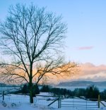
View attachment 581
Thank you, Helene for the critical comments. I have tried your suggestions,at the same time tried to maintain the overall character of the scene. see what you think of it now. I am sure in your hands, it may improve more. Suggestions are welcome.
Oh yes! So much better! Wouldn't you agree? How do YOU like it? Don't you find that it's nicer to look at, easier on the eyes, more definition to the overall picture? Nice work, premc!
Joseph Bautsch
New member
Helene - Your suggestions are right on. PREMC44 - You have a good eye for what is needed. The revised photo and re-cropping to eliminate some of the competing elements has made a substantial improvement. The added color and definition to the clouds give it more depth. I would like to see a little more detail in the shadows of the tree and shrubs. Also a suggestion to help keep the horizon level is to use the view finder grid. By default the grid is off, go in the camera menus and turn it on. No matter how good the composition if the horizon is not level the photo will have a "wrong" feeling to it.
(Great minds abound).
(Great minds abound).


