You are using an out of date browser. It may not display this or other websites correctly.
You should upgrade or use an alternative browser.
You should upgrade or use an alternative browser.
Looking for critique on this photo
- Thread starter Krs_2007
- Start date
BackdoorArts
Senior Member
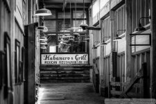
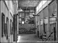
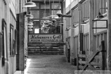
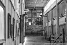
The think that takes the most away from it, for me, is that you are not looking down the center of the hallway. Perspective is too far to the right and it makes all the lines just a little off. You can get the left wall straight, but the sign and the lines in the ceiling are off.
I pulled it into LR5 and clicked on "Full" in the Perspective Correction section and it cleans up the lines, but it still looks a little off. I can't tell you how many times I've taken a photo like this and gotten home to find that all I needed to do was step 3 inches to the left or right to make it "right", but from where I stood it looks off balance. I do this shooting at the front of buildings too, standing inches off center.
I pulled it into LR5 and clicked on "Full" in the Perspective Correction section and it cleans up the lines, but it still looks a little off. I can't tell you how many times I've taken a photo like this and gotten home to find that all I needed to do was step 3 inches to the left or right to make it "right", but from where I stood it looks off balance. I do this shooting at the front of buildings too, standing inches off center.

The think that takes the most away from it, for me, is that you are not looking down the center of the hallway. Perspective is too far to the right and it makes all the lines just a little off. You can get the left wall straight, but the sign and the lines in the ceiling are off.
I pulled it into LR5 and clicked on "Full" in the Perspective Correction section and it cleans up the lines, but it still looks a little off. I can't tell you how many times I've taken a photo like this and gotten home to find that all I needed to do was step 3 inches to the left or right to make it "right", but from where I stood it looks off balance. I do this shooting at the front of buildings too, standing inches off center.
View attachment 78119
Thanks Jake, I actually shot this from both sides looking for something different. After reading what you wrote I should have stepped forward in front of the gate on the right and taken the shot. The issue I was running into was the gate became center point if I stood in the center. I will get to go back and will keep you notes in mind. I think I will try stepping back and then stepping in front of the gate.
I really liked this hallway, just something about it.
I too find the "off-center" feel distracting. You might have gone right on the wall and shot down the hallway, but then perhaps you wouldn't get the full effect you were after. Centers are hard to find, and I often struggle with something being just a little off, too. Without a surveyor's kit, it's kinda tough! LOL
As far as the gate becoming the center of the focus, I kind of like it there. Maybe a little less DOF so that it's blurred out slightly, or perhaps pushed back a little more out of the way? I wonder what it would look like wide open at the 2.8? Stepping in front of the gate would steal the length of the hallway, which adds to the overall feel, I'd think.
As far as the gate becoming the center of the focus, I kind of like it there. Maybe a little less DOF so that it's blurred out slightly, or perhaps pushed back a little more out of the way? I wonder what it would look like wide open at the 2.8? Stepping in front of the gate would steal the length of the hallway, which adds to the overall feel, I'd think.
KRS.........
I like your rendition. But, what do I know? :disturbed::cower:
Ha, Thanks Ted, thats what I really like about this site. You will find someone that likes your picture....Kidding.
If you see something then let me know. I want to recompose this and do it right because this could be one that I actually frame for my office.
I really look for subjects that would make good black and whites, which gets me in trouble with my wife because our kids are not in the photo. Had to show her some shots and say this is what I want to be good at.
rocketman122
Senior Member
First off all, when it was buffering the photo, I said, wow, what a nice image. the feel is great. it made me smile. rustic old place. it has nice DOF. it give a feeling of space.
dragon does make some sense with the crop and horizontal correction but its maybe a bit too tidy. I didnt notice the left windows at all as my eyes went straight to the sign and lights. I did notice and said, wish it had more contrast. I do like the wider angle your original had because its leading my eyes like a funnel to the sign and lights. maybe burn the left images down or add a light vignette. but truthfully, I like "imperfections" (if we call them that) in pictures. really made me smile though. maybe the sign needs a bit more sharpening and contrast to make the final destination are eyes are led to much more prominent. but truthfully, I was happy the first second I saw it and now, Im just nitpicking. all in all, I like it very much. theres a wonderful feel about it. cheers buddy!
dragon does make some sense with the crop and horizontal correction but its maybe a bit too tidy. I didnt notice the left windows at all as my eyes went straight to the sign and lights. I did notice and said, wish it had more contrast. I do like the wider angle your original had because its leading my eyes like a funnel to the sign and lights. maybe burn the left images down or add a light vignette. but truthfully, I like "imperfections" (if we call them that) in pictures. really made me smile though. maybe the sign needs a bit more sharpening and contrast to make the final destination are eyes are led to much more prominent. but truthfully, I was happy the first second I saw it and now, Im just nitpicking. all in all, I like it very much. theres a wonderful feel about it. cheers buddy!
rocketman122
Senior Member
btw, whats the rate thing on the bottom right of your first post? its a new thing?
@rocketman122, Thanks, contrast I can see adding that. I played with it for a while and finally decided to upload.
Well the rating is for this section of the forum and thats what you are seeing with on the first post. You can rate a picture on the merits of a photo by using this system or comment. I believe you only get this by using the Critique section of the forum, but could be wrong.
Again Thanks for comments.
rocketman122
Senior Member
wth did I do wrong. it only gave 4.7/10..why? I only gave 4 on 4 criteria. the rest were 5's. why 4.7/10?
wth did I do wrong. it only gave 4.7/10..why? I only gave 4 on 4 criteria. the rest were 5's. why 4.7/10?
LOL, I dont know, maybe you did while I was adding a new version of the picture. Not sure.
rocketman122
Senior Member
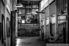
No I think the sign should be a bit brihter but the edges just a bit darker so the eye leads right to the middle. the tone on the sign seems darkened as well. truthfully, im just nitpicking...do this and do that. I think the photo is a very nice feel good image. its simple and just works. theres a lot of good energy in it and I like the long focal length that gave it compression and depth.
No I think the sign should be a bit brihter but the edges just a bit darker so the eye leads right to the middle. the tone on the sign seems darkened as well. truthfully, im just nitpicking...do this and do that. I think the photo is a very nice feel good image. its simple and just works. theres a lot of good energy in it and I like the long focal length that gave it compression and depth.
Ok, gotcha, will be a good test for my editing skills. I'll see what I can come up
No I think the sign should be a bit brihter but the edges just a bit darker so the eye leads right to the middle. the tone on the sign seems darkened as well. truthfully, im just nitpicking...do this and do that. I think the photo is a very nice feel good image. its simple and just works. theres a lot of good energy in it and I like the long focal length that gave it compression and depth.
Is this more what you are thinking.
