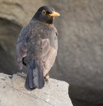
Blackbird with Tamron SP 70-300mm f/4.0-5.6 Di VC USD

Mycenius

Senior Member
I just got my new Tamron 70-300 last week and had my first outing with it at the weekend... This Blackbird is one of the shots I got at one of the local beaches on Saturday. It was a rather spontaneous shot as I turned around and the bird was sitting there about 4m away from me on some rocks. I did not have time to adjust ISO from my prior shots (I had ISO up because it was a fairly grey day and I was trying to keep shutter speed fast to help increase sharpness, although it wasn't fast in this case). I've also only had my D7100 for a month so haven't yet tweaked it much (e.g. playing with the default exposure or sharpness settings) - so it's mostly on factory defaults for those...

Howick_Beach-710683-2.jpg

D7100 | Tamron SP 70-300mm f/4.0-5.6 Di VC USD with Marumi DHG UV/LP Filter | ISO 500 | f/5.6 @ 300mm | 1/60

The above crop is close to 1:1 off the original D7100 24MP image.

I like the sharpness of this image (I'm becoming a little obsessed with fast glass), and the pose of the bird looking back over it's shoulder (it had detected my movement and was looking at me with one eye - luckily I turned but didn't approach directly or move too quickly). I'm very happy with the depth of field effect (the rocks behind are only about 30cm/1' from the bird) and the bokeh effect they have achieved. I cropped the image fairly tightly as I wanted to have the bird fill a fair portion of the frame and emphasise the detail of it's plumage and eyes & beak. I especially like that you can clearly see the brown in it's eyes, and it's whiskers around the beak (and the grains of sand stuck to the beak).
 
I think you did a great job. The only thing I would have done different is crop it so there is a little (And I do mean little) more room on the right side of the bird. Tip of the beak almost dead center of the shot. Give the bird somewhere to be looking.
 

Mycenius

Senior Member
Thanks Guys - and yes Don, I had considered that - was a trade off between how large I could keep the bird within a 1200x800 image (to retain the detail) versus how much artistic input into the image (i.e. as you suggest more space to give the blackbird more context).
 

Mycenius

Senior Member
I think you did a great job. The only thing I would have done different is crop it so there is a little (And I do mean little) more room on the right side of the bird. Tip of the beak almost dead center of the shot. Give the bird somewhere to be looking.

Hopefully this is allowed within the critique sub-forum - I have reprocessed the image in LR5 (both the colour/exposure/etc and the cropping) taking your comments into consideration Don:


Hminx

Senior Member
In the first image the beak and eye surround look a bit over saturated. I prefer the colours in your edit but now the beak appears blown out along the top. Also there seems to be a bit much negative space on the right, making the image look a little unbalanced.
 

mikew_RIP

Senior Member
Always difficult when you move away from your vision of an image to a suggested one,i prefer the colour and saturation of the first but i think the crop should be somewhere between the two,hope you dont mind but this is more of how i see it for crop.

howick_beach-710683-3 copy crop.jpg

Others may see it different,i guess you had no more space at the top,i would prefer a little more at the top and maybe a little less at the bottom but the shot itself gave you all you needed to work with,well done.

mike
 
Last edited:

Mycenius

Senior Member
In the first image the beak and eye surround look a bit over saturated. I prefer the colours in your edit but now the beak appears blown out along the top. Also there seems to be a bit much negative space on the right, making the image look a little unbalanced.

Yeah - the top edge of the beak is over exposed in the original - I prefer slightly saturated colours so usually dial them up a small notch in PP, in the original I had attempted to remove the blown out edge of the beak, in the latter pic I didn't do anything specifically to try and compensate for that... I'm only using LR5 for now for basic edits (I have had Photoshop CS3 since it came out but am limiting myself to LR temporarily at present); and as I hadn't used LR for several years (since version 1.5, I've just resumed using it with version 5) I'm still 'relearning' what it's capable of.

...and yeah - wasn't sure if I opened up too much space with that second crop...

​Appreciate the feedback...
 

Mycenius

Senior Member
Always difficult when you move away from your vision of an image to a suggested one,i prefer the colour and saturation of the first but i think the crop should be somewhere between the two,hope you dont mind but this is more of how i see it for crop.

View attachment 44678

Others may see it different,i guess you had no more space at the top,i would prefer a little more at the top and maybe a little less at the bottom but the shot itself gave you all you needed to work with,well done.

mike

Thanks Mike - appreciate the feedback. Yes heaps of room in the image - there is plenty of space around all 4 sides of the bird in the original - the original image above is about 90%+ crop of actual pixels from original - and only represents about 1/5 of the total area of the original image...
 
Top