Magic Hour in Bruges

Eduard

Super Mod
Staff member
Super Mod
I was reworking a throwaway image from last spring in Bruges in Lightoom 5 to see how the new features work. I realized that I have a pretty good shot but have a few questions for critique:


  1. Is the left edge of the frame too dark?
  2. Is the top right sky too bright?
  3. Should the sunlight reflection in the glass of the white building be reduced?
  4. Is there too much of the water in the foreground - should it be cropped?

Thanks in advance for your feedback!
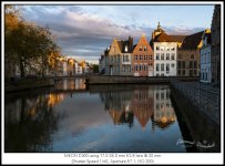
Magic Hour in Bruges.jpg
 

BackdoorArts

Senior Member
1. Is the left edge of the frame too dark? Yes - at least the half above water. For me the entire shadowed area above the water to the left of the red building is a little too dark, including the stones of the bridge/walkway.
2. Is the top right sky too bright? Not necessarily. It might look less bright if the things in #1 are lightened.
3. Should the sunlight reflection in the glass of the white building be reduced? Not for me.
4. Is there too much of the water in the foreground - should it be cropped? Your "Edit Images" is set to NO, so I will respect that and not post my crop, but I find that if you keep the same photo ratio and drag the crop from the bottom left corner until you have only a little water showing between the reflection of the white building it makes for a more pleasing photo as it also eliminates a lot of the dark areas discussed above. It does shoot any Rule of Thirds composition out the window, but I believe it does allow the rail on the right to lead into the frame a little better.
 

Eduard

Super Mod
Staff member
Super Mod
Thanks for the feedback Jake!

The trees on the left are in shadow from the buildings on the right side of the canal - you can just about make out the shape towards the top third of the tree. My concern in lightening was that it might make the overall image out of balance. The light was low and just peaking over the buildings as it was almost 9 pm which is why the red building you referred to was in shadow.

I've actually gone back and forth on the crop and have a version exactly as you suggested using the railing to lead into the image.

Thanks!!!
 

Michael J.

Senior Member
I think cos of the reflection it looks wonderful, So for me it doesn;t matter that the tree on the left is a bit dark cos the reflections makes it interesting. I think a bit more crop is OK but not necessary.

Don't forget my opinion is not professional cos I am jsu a beginner and tell what I feel if I see a pic.
 

Kodiak

Senior Member
a few questions for critique:


1. Is the left edge of the frame too dark?
Nope! It is there, it is expected and it does a very good job at framing the subject

2. Is the top right sky too bright?
Nope! It is there, it is expected and it does a very good job at framing the subject
via high keys.

3. Should the sunlight reflection in the glass of the white building be reduced?
This is the only thing wrong with this picture! see lower ***

4. Is there too much of the water in the foreground - should it be cropped?
Nope! It is there, it is expected and it does a very good job at framing and supporting
the subject

***
This is the only thing wrong with this post! Not the picture but the title… in my book,
the shot is perfect! But this is not the magic hour!

The magic hour is somewhat later. Precisely when the artificial lights are equal in value
to the residual daylight.

The photograph is great, the title, too early!

Congratulations!
 
Last edited:

ohkphoto

Snow White
I was reworking a throwaway image from last spring in Bruges in Lightoom 5 to see how the new features work. I realized that I have a pretty good shot but have a few questions for critique:


  1. Is the left edge of the frame too dark?
  2. Is the top right sky too bright?
  3. Should the sunlight reflection in the glass of the white building be reduced?
  4. Is there too much of the water in the foreground - should it be cropped?

Thanks in advance for your feedback!

View attachment 42424


I'm just going to play off Jake's critique because I agree with ALMOST all of it.

1. I think it would benefit from a little more light on both sides . . . just a tad. I think the interplay between the light and the shadows is much of the beauty of this shot and you captured it well.
2. no . . . I see it as perfect.
3. also no.
4. I think brightening both sides would eliminate any need for cropping. I don't always follow the rule of thirds, but IMHO, cropping out the water on the bottom would destroy the pleasing flow of the composition. . . . as it is, even with the dark edges, the water draws my eye right into the middle of the photo . . . I find myself wanting to travel further down the canal/river. There's something about "bisecting" an image,( which would happen if you crop out the bottom), that screams "dead end" . . .

Great photo, Eduard. So, in your opinion, is upgrading to LR 5 a good move?
 

Eduard

Super Mod
Staff member
Super Mod
Thanks Helene and Kodiak!

I love the light in northern Europe. . . it is almost a pastel pallet to my eye. It is a tough image because of the angle of the setting sun and the shadows. As I processed I was very careful to maintain the true to life shadows which is why I didn't lighten the dark areas too much. I will give Helene's recommendations a whirl when I get home.

I'm liking LR5. The changes are not as dramatic as LR3 to LR4 but it "feels" a little more solid. I'm not sure if it is the product itself or my level of comfort in use. I haven't tried the offline catalog feature but will soon - that seems to be the most exciting feature of LR5. The new perspective stuff is pretty amazing. I'll see if I can post an example.
 
Top