One model, three portraits

steadyJaw

New member
Hi!
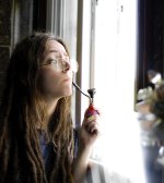
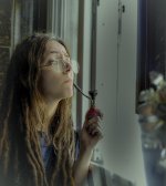
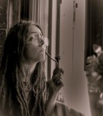
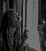
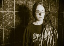
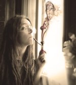
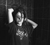
I'm starting to learn how to shoot portraits and I wanted to make something different, so I called my very special friend and tried illumination with natural light.
Here are 3 pics from the "session". Don't be afraid to be harsh if my pics make your eyes bleed ;-)


d1P3n5I.jpg


Nikon D60,
Nikkor AF 18-55mm f/3.5-5.6G

Focal: 23mm
Aperture:f/3.8
Shutter:1/30s
ISO: 100

It was taken in the bathroom because I didn't have a better place at the moment, with the cloning tool in PS I eliminated things from the background.
My problem is always post-processing, for example, in this pic, I think the skin looks weird. Also, I'm not a fan of the reflection in her lenses =(


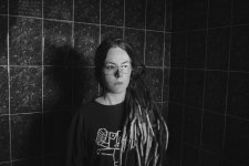
4VpVT33.jpg


Nikon D60,
Nikkor AF 18-55mm f/3.5-5.6G

Focal: 23mm
Aperture:f/3.8
Shutter:1/25s
ISO: 100

This one may have too much post processing...

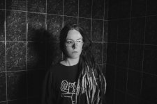
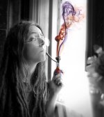
Hrguvrn.png


Nikon D60,
Nikkor AF 18-55mm f/3.5-5.6G

Focal: 23mm
Aperture:f/3.8
Shutter:1/25s
ISO: 100

I wanted this one to have a mystical atmosphere, that's why there is that very intense lighting coming from the window.
But I think I went too far and it looks overexposed.
AND AGAIN THE REFLECTION =(

I have to buy a polarizing filter.
Let me know what you think!
Cheers!
 
Last edited:

gqtuazon

Gear Head
As what you have notice especially on the first image, the image would have turned out much better without the eyeglasses.

Good composition and use of natural light on the 3rd image.
 

Eyelight

Senior Member
Not considering the eyeglasses, for me, all three are in that realm of "different", that you almost can't tag with a thumbs up or down, which I think always defaults to a thumbs up. The glasses are part of the personality, so that is a tough fix.

#1 - Chin right and camera left may take care of the reflection. This pose, eyes would look better if they are looking in the same direction as nose and chin.

#2 - Overall less light might look better for the pose.

#3 - Good pose. I'm thinking B&W.
 

Blacktop

Senior Member
Don't be afraid to be harsh if my pics make your eyes bleed ;-)


The first one looks like she's in a bathroom shower lookin all pissed about the sun shining on her left eye.

The second one could be ok, but for that shower tile thing happening.

I like the third, but it would be better if she lit that thing up and passed it around.
 

Blacktop

Senior Member
The more I look at the 3rd picture, the more I like it. I took the liberty of touching it up(actually toning it down) a bit in lightroom' You have image editing enabled in your profile.

Before.

Hrguvrn.jpg

After i turned down the lights some.

Hrguvrn-2.jpg
 

Blacktop

Senior Member
The first photo is a challenge, but after looking at it some more, I think it can be improved upon with some cropping.
Here is my take on the first photo. (BTW, steadyJaw. If you don't like what I'm doing , let me know and I will take them down)

Original
d1P3n5I (1).jpg

My take on it.
d1P3n5I-2.jpg
 

Eyelight

Senior Member
I don't know if it needs to be cropped. It's one of those shots that says, "I'm different". I thought seeng both eyes would be good. Same here if you prefer, I can remove.

d1P3n5I_Eye.jpg
 

steadyJaw

New member
Oh my gawd THANK YOU!
I'm a fan of your comments! It's probably one of the best feedback I have received so far.
Hell, it's the best.
Please don't stop retouching my work. For me, art is a bit like software, it is better when we all work together to make something bigger and better.


@gqtuazon:
Thank you! I'm still learning to manipulate natural light, I'll continue working hard!

@Eyelight:
I'm taking good note of your suggestions!
I wasn't expecting so much love for the third picture XD

About the eyes up or down, she wanted more that "Dreamworks eyebrown" look, lol. But it would probably be eyes up, as she is such a dreamer.
Good cloning of the eye, I tried to clone it but I wasn't pleased with the result. I really suck at post-processing.
I'm gonna take all your good advice and make better shots. I almost died when I saw the reflections, how could I not see them when I was shooting? Argh.
Thank you for your feedback!

@Blacktop:
"it would be better if she lit that thing up and passed it around".
I laughed so hard with this one XD
Please have a bit *passes the pipe to Blacktop*

I really liked the sepia style you gave to the third one. It really looks like a picture from a book about a story in the forest with dwarfs, elves and trolls. I love it!
About the first one, I have one version in color with the exact same cropping:

DHj8Su1.jpg


But I am not convinced about the colors, they look a bit plain, like meh.
Without the cropping it reminds me of industrial lines, which makes a bit of a contrast with my hippie friend.
But it's true that it shouts BATHROOM TILES too. XD

Thank you for your advice and ideas!
I really have learned a lot with your corrections =D
Cheers!
 
Last edited:

hark

Administrator
Staff member
Super Mod
Contributor
The uncut pic reminds me of industrial lines, which contrasts a bit with my hippie friend.
But it is true that it shouts BATHROOM TILES too. XD

So why not use either the clone stamp or healing brush to remove the straight lines created by the tiles? Then it wouldn't look so much like BATHROOM TILES as you mentioned. :)
 

BackdoorArts

Senior Member
Since we're taking turns...

Hrguvrn.jpg


I decided that if the light was going to be there then blow it out so you lose the details and give it meaning. I brought out some definition in the hair, applied a vignette centered on her face and darkened anything dark that was outside of her. I then selected the visible lens into its own layer and played with it until I could get an approximate luminance match to the other, and then masked her eye back in a touch and dodged away the shadows from the reflection to make it less pronounced. I stuck the negative frame around it as I thought it made it look like it could have fallen out of an old drawer from the 60's.

One pill makes your larger...
 
Last edited:

Eyelight

Senior Member
You know. I like the lines. The title for this work is "The hippie against the squares."

My first attempt at an eye transplant. Actually the first was when I flipped the eye, but that made her look for the bug on her nose again. The result you see was:

- reflection removal in left eye with clone and healing brushes working from top and bottom toward the corner of eye
- a lasso selection of left eye
- new layer via copy to make the new eye easily positionable
- position new eye over empty socket
- lighten the skin around new eye using eraser low-opacity
- merge the layers
- clone and healing brush worked round to stitch the new eye into position
- darken the pupils to remove reflection

To catch reflection issues, first you remember that glass reflects light stronger than everything else :), and then your eye without the camera needs to be where the camera will be. Eyeballs reflect light just like glass does, so even without glasses, watching the reflection is important.

This one has a 4 pixel wide reflection added back to each eye.
d1P3n5I_Eye_Lit.jpg
 

steadyJaw

New member
I'm amazed to see the beautiful things you are able to do to my ugly and amateurish pictures.
It is so inspiring.

So why not use either the clone stamp or healing brush to remove the straight lines created by the tiles? Then it wouldn't look so much like BATHROOM TILES as you mentioned.

Good call!
I fixed the eye and erased the vertical lines. How do they compare now?
For the eye I followed the steps shared by @Eyelight (thanks for the tips, man!), and then corrected the mess I made with the liquify filter.

With tiles:
0ktm65J.jpg


Without tiles:
lhG5j3q.jpg


One pill makes your larger...

What an accurate and "slick" reference, sir ;-)
And I love what you did with the light. It really has that mystic aura I was searching for. I also like the way you dealt with the reflection.

I tried the B&W following your steps, and added free stock smoke from here and here, since @Blacktop's comment about lighting it up kept me thinking.
Then I realized the red and violet smoke looked a bit cheesy and decided to go for a sepia. This is the result:

B&W:
07_WB.jpg

Sepia:
07_sepia.jpg

Thank you for the tips!


You know. I like the lines. The title for this work is "The hippie against the squares."

Hahaha... that title is PERFECT my friend. High five!

I followed your advice and I think I am more satisfied now with the result.
There is still room for improvement, but I think this looks much better.
I like the 4 pixel wide reflection you added, it looks natural.

There is no excuse or retouching for bad pictures so I'll keep trying hard!
This has been a lot of fun. Thank you guys!

P.D. Eyelight, it is better if you open the image in full size to see the details of the eye. She is still a bit "looking at the bug at her nose" XD but it is much better than what I had before reading your tips.
 
Last edited:

Eyelight

Senior Member
@steadyJaw , nice job on the brick wall. Might as well move the eye a little.:)

The modern digital photograph can be produced one pixel at a time. The camera just makes the first 99.99999% of the work a little easier.
 

wud

Senior Member
Hi there, I'm really a fan of your first posted 3 pictures. So honest and raw, and I like the expressions on your model.

The first needs to be without the window light removing sight of her eye - as you know.

The second one is great, love the colors in it.

The third I would add some contrast as her skin looks a little grey. Maybe the blurred out thing in front are a bit distracting? You got a lot of great vertical lines going on behind her :)


Do keep shooting her with glasses on, next time you'll pay more attention to the light reflecting.
 
Top