Horoscope Fish
Senior Member
For this installment we are going to be discussing another tool that can lend power to our photographic composition, one that directs attention to our subject. A good photograph, as has been mentioned before, has a clear subject and may contain numerous subordinate elements. My feeling is that if a subordinate element is not adding to my photo, then it's detracting from my photo. To this end I attempt to put every element in a photo to work strengthening the composition. One way to do this is to use subordinate elements to direct the viewers attention to the main subject. This can be achieved by muting or blurring the background (bokeh), controlled lighting, or with graphic control which is what we're really going to be discussing here; specifically by looking at a compositional technique called "Leading Lines".
A Leading Line is just that, a visual cue that extends and leads the viewers eye to the heart of our photo. These lines most commonly begin at the bottom of a composition and extend to the subject, or close to it, bringing the eye with it. A leading line can be formed out just about anything but railroad tracks are a classic example. Other sources for leading include things like fences, roads and bridges. One of the mistakes I made when I first started shooting with leading lines was mistaking my leading line *for* my subject. While I think this can be made to work I don't see it happening very often. Here are two examples using my own photos. Notice how both shots have a strong leading line in them, the first being horizontal, the second vertical:

Leading Lines, horizontal
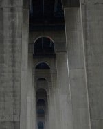
Leading Lines, vertical
Okay, so what's wrong with these shots? Simple answer is, they have no clear subject. I could argue the lines themselves are the subject but that's just weak. It didn't cut any ice with my instructor at the time and it's probably not cutting any ice with you, right now. The simple fact is, they work only marginally because while they have a strong leading line and a little visual impact, the lines in these photos take us precisely... Nowhere.
For the most part, and there are always exceptions, leading lines that simply lead the viewer nowhere are not going to help your photo. That pedestrian bridge on a white sand beach extending deep into a crystal blue Caribbean sea? Who gives a rats ass? It's BORING. Why is it boring? Because it's another example of a shot without a subject and a leading line that drops us off in the middle of nowhere. Don't do that. Don't take boring shots and don't drop your viewers off in the middle of BFE. For our non-native English speakers who may not be familiar with the phrase BFE, please see this Urban Dictionary explanation.
Okay, so here's an example of what I'm talking about:

Boring Bridge Going... Nowhere. BORING!!!
The above shot has some pretty pleasing visual impact, but doesn't it leave you feeling somewhat less that satisfied? It does me... Okay, sure, so it's pretty. But like a beautiful woman with no intelligence the conversation wears thin all too soon and what are we left with? Too much symmetry, no clear subject and a road that takes us nowhere. Wow... I think we can do better.

Leading Line as Tool, a Journey... With a Destination! YES!!
Photo provided courtesy of Nikonites poster Moab Man
Now that's an example of well executed leading line. Notice how strong the line is to begin with and that it leads our eyes TO something; in this case a beautiful mountain landscape and some very ethereal light. The leading line in this photo serves as an element but not the subject. This subordinate element, though, empowers the photo by being both strong yet functional as it walks our eye right up and deeper into the shot. It's a journey with a destination. Notice too, how this photo employs the compositional Guideline of Thirds: two thirds foreground, one third horizon. That's no mistake, that's forethought. That's planning... That's freaking composition and a nicely done compositional two-fer! DAMMIT!!
Let's take a look at another take on the use of leading line this time we're looking at a photo by master photographer Henri Cartier-Bresson.
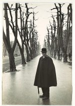
Whar Leading Lines?! Whar??!
Note the careful composition of this seemingly simple shot, HCB gives us a sense of off-handedness with this composition making it appear almost candid. The skillful execution of perspective and leading line though tell us it is anything but casual...
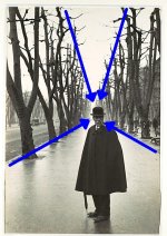
Thar Leading Lines! Thar!!
Notice how HCB has used organic leading lines to bring and hold our attention on our subject. Not only does the tree line and the road way converge, they converge at the most critical juncture OF our clearly defined subject. While this may be the simplest and most obvious compositional trick, done properly, it’s not at all obvious and adds surprising impact to a photo.
One of the strongest forms of leading line is the gaze of any human subject. This line is, of course, completely invisible, yet in compositional terms it’s probably stronger than any other type. Notice how HCB has the model looking directly at as. Visual gaze, a powerful even if invisible leading line.
Okay, that's it for this installment. There's a LOT more that could be said about Leading Lines and how to use them to strengthen your composition but I have to wrap up this tutorial for now. I hope everyone finds something useful here.
.....
A Leading Line is just that, a visual cue that extends and leads the viewers eye to the heart of our photo. These lines most commonly begin at the bottom of a composition and extend to the subject, or close to it, bringing the eye with it. A leading line can be formed out just about anything but railroad tracks are a classic example. Other sources for leading include things like fences, roads and bridges. One of the mistakes I made when I first started shooting with leading lines was mistaking my leading line *for* my subject. While I think this can be made to work I don't see it happening very often. Here are two examples using my own photos. Notice how both shots have a strong leading line in them, the first being horizontal, the second vertical:

Leading Lines, horizontal

Leading Lines, vertical
Okay, so what's wrong with these shots? Simple answer is, they have no clear subject. I could argue the lines themselves are the subject but that's just weak. It didn't cut any ice with my instructor at the time and it's probably not cutting any ice with you, right now. The simple fact is, they work only marginally because while they have a strong leading line and a little visual impact, the lines in these photos take us precisely... Nowhere.
For the most part, and there are always exceptions, leading lines that simply lead the viewer nowhere are not going to help your photo. That pedestrian bridge on a white sand beach extending deep into a crystal blue Caribbean sea? Who gives a rats ass? It's BORING. Why is it boring? Because it's another example of a shot without a subject and a leading line that drops us off in the middle of nowhere. Don't do that. Don't take boring shots and don't drop your viewers off in the middle of BFE. For our non-native English speakers who may not be familiar with the phrase BFE, please see this Urban Dictionary explanation.
Okay, so here's an example of what I'm talking about:

Boring Bridge Going... Nowhere. BORING!!!
The above shot has some pretty pleasing visual impact, but doesn't it leave you feeling somewhat less that satisfied? It does me... Okay, sure, so it's pretty. But like a beautiful woman with no intelligence the conversation wears thin all too soon and what are we left with? Too much symmetry, no clear subject and a road that takes us nowhere. Wow... I think we can do better.

Leading Line as Tool, a Journey... With a Destination! YES!!
Photo provided courtesy of Nikonites poster Moab Man
Now that's an example of well executed leading line. Notice how strong the line is to begin with and that it leads our eyes TO something; in this case a beautiful mountain landscape and some very ethereal light. The leading line in this photo serves as an element but not the subject. This subordinate element, though, empowers the photo by being both strong yet functional as it walks our eye right up and deeper into the shot. It's a journey with a destination. Notice too, how this photo employs the compositional Guideline of Thirds: two thirds foreground, one third horizon. That's no mistake, that's forethought. That's planning... That's freaking composition and a nicely done compositional two-fer! DAMMIT!!
Let's take a look at another take on the use of leading line this time we're looking at a photo by master photographer Henri Cartier-Bresson.

Whar Leading Lines?! Whar??!
Note the careful composition of this seemingly simple shot, HCB gives us a sense of off-handedness with this composition making it appear almost candid. The skillful execution of perspective and leading line though tell us it is anything but casual...

Thar Leading Lines! Thar!!
Notice how HCB has used organic leading lines to bring and hold our attention on our subject. Not only does the tree line and the road way converge, they converge at the most critical juncture OF our clearly defined subject. While this may be the simplest and most obvious compositional trick, done properly, it’s not at all obvious and adds surprising impact to a photo.
One of the strongest forms of leading line is the gaze of any human subject. This line is, of course, completely invisible, yet in compositional terms it’s probably stronger than any other type. Notice how HCB has the model looking directly at as. Visual gaze, a powerful even if invisible leading line.
Okay, that's it for this installment. There's a LOT more that could be said about Leading Lines and how to use them to strengthen your composition but I have to wrap up this tutorial for now. I hope everyone finds something useful here.
.....
Last edited:

