You are using an out of date browser. It may not display this or other websites correctly.
You should upgrade or use an alternative browser.
You should upgrade or use an alternative browser.
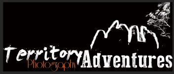
My logo
- Thread starter Scott Murray
- Start date
BackdoorArts
Senior Member
It's interesting. Are you planning on using it as a watermark or simply as a logo? My trouble with it would be that I'm not sure if you're Territory Photography Adventures or Territory Adventures Photography. Not that it would necessarily matter.
Scott Murray
Senior Member
My business name is Territory Photography Adventures. If its confusing then I need to change it.
My business name is Territory Photography Adventures. If its confusing then I need to change it.
Then maybe the same typeset should be used and be on the same line. The different typeset and color makes it confusing, to me at least.
Scott Murray
Senior Member
rocketman122
Senior Member
3 fonts. other than that, seems ok to me. like the graphic of the hills/tree. seems to be a lot of empty space to the left at top.
Scott Murray
Senior Member
Ok another slight change and I think this works.

I like this one best! 
GameOfMoans
Senior Member
2nd one is much better and a keeper.
Scott Murray
Senior Member
Once I get my new camera vehicle that is exactly what I will be doing.What I think of when I hear the name is that you offer to take people on an adventure to photograph things.
Sweet.Once I get my new camera vehicle that is exactly what I will be doing.
Scott Murray
Senior Member
Where? I have not seen them!!!!I made two posts to this topic and both are now gone, at least to my eyes. So be it and I am done.


