Scott Murray
Senior Member
Well I am slowly adding products to my website, feel free to have a wander around and tell me what you think or where I can improve.
Home | Scott H Murray Photography
Home | Scott H Murray Photography
I am planning on removing some and adding more.Very nice Scott.
You could of course add some good photos.
Seriously it is really good and coming along nicely.
I have just added more categories and yes I will be advertising and offering tours from my website, I am in the process of designing that page.Why remove any?
All of those are very good.
Maybe categorise them and limit your self to a certain number of categories.
Will you be using this to promote your photographic tours in Australia?
Added replies in bold.this is just my opinion.
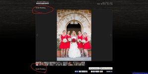
1-logo needs to be more prominent/larger. more the center of the website. front page needs some centering. all the media stuff at the bottom and the logo and other texts need a tidying up. you have smith wedding twice on their gallery page.
I will be re-doing the logo as the business name is 'Territory Photography Adventures' my trading name is Scott H Murray.
Smith wedding shows up once for me?
2-not liking the font. needs to be more stylish. doesnt have to be very fancy but looks like a regular basic tahoma
Will be working on the font
3-in your photos page the tiles seems a little outdated. how about longish rectangles side by side (minimal space between them) with the sections under.
I am limited to my layout.
4- im a big fan of efficient websites. the less I have to click to get to the work the better. I like websites that lets me hover over weddings and then will give me a preview to different weddings that I can click into. I dont like clicking on weddings then clicking on a specific wedding. if it was flash it would be very fast, but html needs to be more efficient.
This is the only current way I know to do this with this set-up
5-the gallery for the wedding is very nice. I love it when the arrow stays in the same place regardless of the picture size/orientation and I can click and go through them quickly. some might say, but I want the couple to stay longer. my take on that is, if they like your work they dont need to see more than 20 pictures to know if they like your work or not. its as simple as that. if the photogs work sucks or not their taste you dont need 100 pictures to figure this out. 20 pics is enough. couples have tons of things they need to do and I know from experience dont have patience to go through so many website to find a photographer. there is a limit till someone is fed up and closes the website. so keeping a coule longer is not the right mindset. it has to be clear concise efficient. not that yours isnt. trying trying to make a point about the great gallery and how fast you can go through the pics.
6-abn is your business number? I would put that on my ME PAGE.

Love your photos Scott. Where did you get the shots of the King Cheetah? They're stunning looking creatures!
p.s. I have no idea about website design so I'll leave the critique to others
View attachment 106171
placement is a personal preference but Id center in over the gallery.
the font will make a big change.
What about making the various section somewhere on the home page? I have to press 3 clicks to get to the smith wedding. we all know people have no patience for endless clicking. if its flash it would be fast but HTML needs to constantly load each page. up to you. what about "gallery" instead of my photos? when I see "my photos", amateur seems to be the thing that comes to mind.
Good points, I will make changes tomorrow.
Sent from my iPad using Tapatalk HD
I made some changes on my ipad but will leave the font changes until later.good luck!
Umm no, if you looked at my albums you would see the titles...cheetahs in australia?
