You are using an out of date browser. It may not display this or other websites correctly.
You should upgrade or use an alternative browser.
You should upgrade or use an alternative browser.
Boat sailed away!
- Thread starter theregsy
- Start date
Joseph Bautsch
New member
Re: Boat coming in
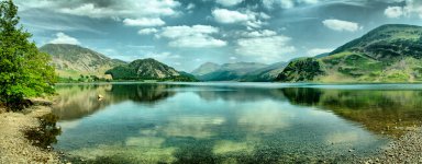
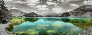
If there is one type of photography where the rule of thirds should almost always be applied and that is in great horizon to horizon scenic shots. Here you have the far shore line where it meets the mountains cutting the shot almost in half. It would work better if you move that shoreline to the upper third of the photo. Not only would it make a more pleasing shot but it will do a lot more to emphasize the reflections in the lake as the subject. Or the other option is to move mountain/lake shoreline down to the bottom third of the photo. That would make a more pleasing shot and would emphasize the mountains and sky as the subject. The color of the lake with everything else B&W just does not work for me. This shot would work better in full natural color.
If there is one type of photography where the rule of thirds should almost always be applied and that is in great horizon to horizon scenic shots. Here you have the far shore line where it meets the mountains cutting the shot almost in half. It would work better if you move that shoreline to the upper third of the photo. Not only would it make a more pleasing shot but it will do a lot more to emphasize the reflections in the lake as the subject. Or the other option is to move mountain/lake shoreline down to the bottom third of the photo. That would make a more pleasing shot and would emphasize the mountains and sky as the subject. The color of the lake with everything else B&W just does not work for me. This shot would work better in full natural color.
JoeLewisPhotography
Senior Member
Re: Boat coming in
Nice! I love the color of the water, the reflection of it and transparency along the shore line. A couple things though.... I think i might prefer this one without the selective color...Just my personal opinion. This effect may work better if the tree to the left was not there....and it was just mountains, and water. Then you would get all the color through the reflections. The more I look at it, the more that tree is distracting me....my eyes keep reverting to it. That single rock poking out of the water should be cloned out as well....it is also a bit distracting. Otherwise, very crisp and creative and with a few minor fixes, it could definitely be a wall shot.
Nice! I love the color of the water, the reflection of it and transparency along the shore line. A couple things though.... I think i might prefer this one without the selective color...Just my personal opinion. This effect may work better if the tree to the left was not there....and it was just mountains, and water. Then you would get all the color through the reflections. The more I look at it, the more that tree is distracting me....my eyes keep reverting to it. That single rock poking out of the water should be cloned out as well....it is also a bit distracting. Otherwise, very crisp and creative and with a few minor fixes, it could definitely be a wall shot.
Browncoat
Senior Member
Re: Boat coming in
To echo what Mr. Bautsch already said, please see the Rule of Thirds.
That said, selective color works well in some shots, and not in others. It doesn't work here. Usually I tend to lean towards B&W photography, but in this case, all color would probably look best unless you feel confident that you can achieve the full tonal range in B&W.
Re: Boat coming in
First off, I wasted five minutes of my life looking for a boat that doesn't exist! (Unfortunately, that pretty much sums up my life) I was never one for reading the caption below first (or directions).
I really like colored subjects against B&W, but several colors/shades/tones blended like this makes it too busy. I also feel the single color technique looks better if it is completely framed in B&W. The water/color running of the edge and bottom of the image destroys all sense of balance.
Re: Boat coming in
Rick, You were too late. The boat was there earlier, it must have sailed away just before you got here.
I like the picture, but the colors seem to pop out a little too much for my taste. I'd say try all color or all B/W.
Then again, what do I know? I'm still hung up on Rick missing the boat.
First off, I wasted five minutes of my life looking for a boat that doesn't exist! (Unfortunately, that pretty much sums up my life) I was never one for reading the caption below first (or directions).
I really like colored subjects against B&W, but several colors/shades/tones blended like this makes it too busy. I also feel the single color technique looks better if it is completely framed in B&W. The water/color running of the edge and bottom of the image destroys all sense of balance.
Rick, You were too late. The boat was there earlier, it must have sailed away just before you got here.
I like the picture, but the colors seem to pop out a little too much for my taste. I'd say try all color or all B/W.
Then again, what do I know? I'm still hung up on Rick missing the boat.
ohkphoto
Snow White
Re: Boat coming in
Thank God! I thought my eyes had gone!
Please ignore the title, I tried to upload a different pic, failed and went with this one instead but forgot to change the title
Thank God! I thought my eyes had gone!
ohkphoto
Snow White
Re: Boat coming in
Is this cropped?
I agree with the other comments, Theregsy. If it's cropped and there's some foreground in the original, I think it might make for better composition. As it is, the selective color and the mountains split the picture in two. I'm not a fan of selective color . . . but I really like the reflection and color of the water. I'm wondering what the whole pic in color looks like.
Re: Boat coming in
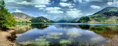
Well I seem to have stirred up a hornets nest here, I appreciate the feedback. I would like to say that I couldn't go back any further or go any wider to include more foreground, but I will attach the full colour version so you can have a peep at that

The concept I had in mind originally was to do a standard pop on this, maybe leaving the sky coloured and teh rest B&W but I swung the coloring around to do something I hadn't seen before and ended up with the first pic (and also the only one I have ever sold LOL).
Hope you like
Well I seem to have stirred up a hornets nest here, I appreciate the feedback. I would like to say that I couldn't go back any further or go any wider to include more foreground, but I will attach the full colour version so you can have a peep at that

The concept I had in mind originally was to do a standard pop on this, maybe leaving the sky coloured and teh rest B&W but I swung the coloring around to do something I hadn't seen before and ended up with the first pic (and also the only one I have ever sold LOL).
Hope you like
ohkphoto
Snow White
Only goes to show you how everybody sees things differently. I love the color one, and again this is how I see it. The color seems to tie it all together and the "bisect" (rule of thirds) is not the first thing I notice. Now I go straight to the color of the lake. It is a beautiful shot, theregsy, and you did really well on this.Well I seem to have stirred up a hornets nest here
Remember, artistic "freedom" gives you permission to break any rule, and it's always good to get the opinions of other photographers. They sometimes show you a different perspective. In the end, you have to decide --it is your photo and your vision.
I applaud you for trying and doing something different. Keep up the excellent work!The concept I had in mind originally was to do a standard pop on this, maybe leaving the sky coloured and the rest B&W but I swung the coloring around to do something I hadn't seen before
Last edited by a moderator:
Browncoat
Senior Member
... rules are made to be broken.
Typically, I would agree with you. But in this case, following the Rule of Thirds will almost always result in a more pleasing composition. This requires some research, but the arts are very closely tied to mathematics. If you dig around, you will find that the most aesthetically pleasing works all follow some basic design principals, and many of the artists also studied math and astronomy. Stonehenge, the pyramids, and countless other wonders of man are all part of some greater scheme that still hasn't been unraveled after thousands of years.
You many not know it, Jen, but even your avatar pic follows mathematics. Have a look at the Fibonacci Spiral.
Ah but Anthony if everyone follows the same rules we just get a lot of pictures that look similar. I have landscapes with a high or low horizon and I have read a lot of books on seeing creatively and photography rules, and some of it has stuck in the cramped space of my head, but sometimes I shoot the way that feels right to me at the time. LOL It's all swings and roundabouts, and we all love and hate different things. Next time I am in the position to take a landscape I will take both (or get wide enough to crop in different ways) and see what works for me. Just looking around the few prints that I have up in the house and they are all 50-50 split (there are only 3 of them) but I think that is how we look at the horizon, your eye is drawn to it and you tend to look along it. But everyone has their own point of view. I DO appreciate the feedback from you all, I will learn, try it and either love it or hate it  Happy Shooting
Last edited by a moderator:
Carolina Photo Guy
Senior Member
You know something? I like BOTH of these pictures. Not the B/W & colorized ones. When the horizon is placed so near the center, you have 2 competing pictures, not one pleasing homogenous photo. By either reducing the sky or the water you combine both competing images into one very pleasant image.
Just my 4 cents worth.
Pete
Just my 4 cents worth.
Pete


