You are using an out of date browser. It may not display this or other websites correctly.
You should upgrade or use an alternative browser.
You should upgrade or use an alternative browser.
Appreciate some feedback.
- Thread starter DMcL
- Start date
Blade Canyon
Senior Member
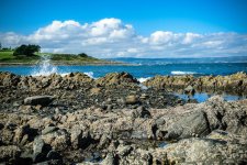
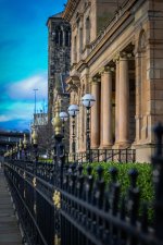
Nice shots. The blues look oversaturated in the first two pics, but the building in pic 2 looks great the way it is. Maybe you could mask the sky and dial it down a little, but leave everything else in that shot the same.
Don Kuykendall_RIP
RIP :(
I like the blues in the first two. I personally think dramatic skis are great for these kinds of shots
DMcL
Senior Member
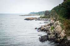
Really quite good -- with Don on the first,, a very nice shot as is. The last has too much going on in an unrelated way; no real compositional definition. There is (to my eye) a good picture to be cropped out of the center -- if I may be so bold:
View attachment 113626
I struggle with composition, this crop highlights my faults nicely and it is a vast improvement. Thank you
Last edited:
Again a nice picture, but also again, without focus. What are you attempting to say? There is a good image story there, but it needs cropping to define it -- again, if I may be so bold:
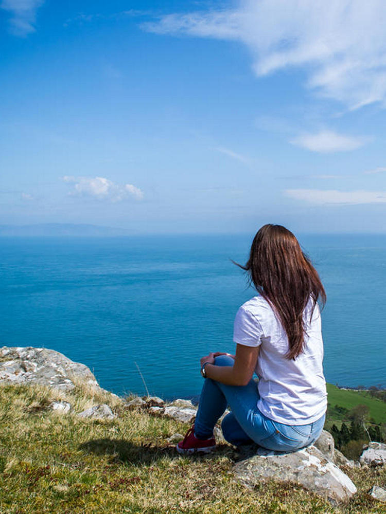
This, to me, sets a question: her pensive pose, directed gaze, the blue expanse, the hazy far shore -- longings? remembrances? disappointments? loss? It is the speculation that brings enrichment.
But this is just my personal take; everyone here will see it differently. The task is for you to decide what you see or want to see.
Don Kuykendall_RIP
RIP :(
The two suggestions are good. Like the one by eyelight better though. Closer to your vision
As I said, each to his/her own eye. Personally, I do not like slicing and dicing, but the end product is acceptable, though I am not sure what the "left" is all about.
I would not take the shot planning to move the young lady, but I liked the composition otherwise and the elements lent themselves to the task, and it was fun to do.
Our two adjustments are actually similar in intent. Yours tells more about the thinker and mine tells more about the thought about.
Though the original may not lead us directly, I think it has a air of wonder just from the sheer magnitude of the view with the young lady in the center of it all. I imagine she is the center of someone's world.
Horoscope Fish
Senior Member
Lots to think about, and yes I can see how having her centred is not as interesting or leading to the eye, so next time I will mix it up a little. Thanks all!
Way Differently...lolAgain a nice picture, but also again, without focus. What are you attempting to say? There is a good image story there, but it needs cropping to define it -- again, if I may be so bold:
View attachment 113744
This, to me, sets a question: her pensive pose, directed gaze, the blue expanse, the hazy far shore -- longings? remembrances? disappointments? loss? It is the speculation that brings enrichment.
But this is just my personal take; everyone here will see it differently.
In this photo, how does having the girl being off-centered make it more interesting or leading? Every good picture tells a story, and the original one tells a whale of a story. Why over-use your "artistic license" when it isn't necessary. Now it looks like just another picture of the sea while on a family vacation. Cropping in this case made it less interesting. It loses the light centering on the girl. It loses the land that might or might not be her home. Even the clouds became less interesting. It took away from the vastness that the cropper insinuated was important. In the cropped version, there is now actually less focus on the girl. Everything you wondered about the girl after the crop, you could wonder about before the crop. The cropper said the picture was "without focus". That is insane.
Photos are also about capturing a moment. You were there, and you were able to see the whole story. That is why you didn't want to leave any of it out.....
The cropper makes the photo tell a story, basically Cliff's Notes. Your version is the entire novel.
I could keep going, but my wife says I had better stop before I get the whole forum hating me...lol. Just disagreeing with you Wev, like you said people would......
Now, If I may be so bold as to return the photo to it's proper state:
View attachment 113737
Probably not. This photo points out the need to compose and frame the shots as many different ways as possible. As long as time is not an issue, it is best to shoot the photo from several perspectives. You gotta move it, move itWell, not the first time I've been termed insane and probably not the last.

