Too Much Green?

RocketCowboy

Senior Member
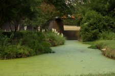
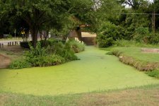
I'm struggling with this image and would appreciate some feedback.

I've been driving by this area and commenting on the standing water and algae, and today had an opportunity to stop and shoot it. Light wasn't great, the sky was starting to cloud up so while there wasn't a lot of harsh shadows (to my eyes anyway), it's just feeling monotone.

I went with this composition specifically to try and get some contrasting background, but it's still feeling to green washed to me.

Any thoughts/suggestions?
WRL 1.jpg
 

Vixen

Senior Member
I'm guessing that as about 80% of the content is greenery ie trees, grass, algae etc them it is going to be fairly monotone regardless :D
 

rocketman122

Senior Member
for me the color isnt the issue. the picture is just a snapshot and lacks a little interest composition wise. sometimes less is more. here you wanted to take a wide shot to leet it all in, but sometimes we have to be selective in the composition to lead our eye in the right direction.

-road on right is distracting
-isle doesnt lead to anything thats recognizable or interesting. you look and im wondering what it is there thats partly hidden but nothing that peaks my interest.
-cement block on right, pwoer line, and pole also doesnt help.
-the light is even and doesnt give depth because no shadows
 
Last edited:

Eyelight

Senior Member
This is one of those scenes that is hard to replicate the image the mind was seeing. Things we don't normally see tickle our brain cells and it's the mossy surface that does the tickling. At first glance, it looks like a paved walkway. If you could somehow enhance the appeal to draw the viewer down the creek.

Playing with the exposure, highlights and shadows may bring out the scene and maybe darken the areas like the roadway to left. The concrete to the right might need to go away.
 

photogramps

Senior Member
Get down on the grass and try to get an image 'along' the algae ... wide angle to get it all in but low enough to avoid the distractions or at least to crop/clone them out without difficulty - it is what it is ... 'green' ... that's what attracted you wasn't it? :)
 

Rick M

Senior Member
I agree with everyone else. You might try HDR and then playing with various levels of green saturation/luminance/hues
 

wev

Senior Member
Contributor
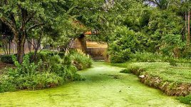
I think I would move in and simplify the comp -- too much balance and sameness of visual weight. Maybe something like this (if I may be so bold)

fhyjdyj.jpg
 

RocketCowboy

Senior Member
-road on right is distracting
-isle doesnt lead to anything thats recognizable or interesting. you look and im wondering what it is there thats partly hidden but nothing that peaks my interest.
-cement block on right, pwoer line, and pole also doesnt help.
-the light is even and doesnt give depth because no shadows

Thanks for the detailed feedback!

I agree with the clutter; I'm struggling with power lines/poles in a lot of places and the cement sewer/water access is distracting.

With lighting, any suggestions on what could be done to add some depth here? The sky was getting overcast with rain coming so lighting was pretty flat, but I'm wondering if I made things worse in post by adding exposure and bumping down the shadows to see under the tree better. Trying to brighten things up looks to have also flattened things down.
 

RocketCowboy

Senior Member
I think I would move in and simplify the comp -- too much balance and sameness of visual weight. Maybe something like this (if I may be so bold)

View attachment 111704

I like that crop! Here's my first capture of the scene, before I tried going wider to get some contrasting color into view:

WRL raw.jpg

That's unprocessed raw, but also shows some of the darkness in the left of the frame that I was trying to lighten a bit.
 

Jamesan

Senior Member
What if he had a boy sitting cross-legged at the far end of the pond with his elbows on his knees and his chin on his hands............. Do that, and with Wev's crop.
 

J-see

Senior Member
Not sure if you desire this but can't you select specific areas of green in PS and drive those to get more contrast between them?
 

BackdoorArts

Senior Member
You need some differentiations among the greens. Foliage contains a large, but varying amount of yellow in the coloration, so when you get a flat green look like this then play with your yellow channel. Easiest way to do this is in Lightroom using the Saturation and Luminance sliders, though you can mess with Hue as well. Drag the Yellows around a bit and see what it does.

I also love Nik Color Efex Pro's Color Contrast filter for things like this. This is it after just messing with that filter. Contrast set at 10, Color Contrast at about 55, Brightness at 0, then slide the color slider to taste. No change in saturation at all. I also cloned out the power line.

WRL 1.jpg
 

jazzjunkie

Senior Member
I thought i'd have a quick play and go extreme. I've cropped the front grass out completely, the yellow signpost and some of the road on the left, also removed the power line and round concrete thing from the right. it's not everyone's cup of tea but I like the high structure and contrast available with color efex

WRL 1-Edit.jpg
 

RocketCowboy

Senior Member
You need some differentiations among the greens. Foliage contains a large, but varying amount of yellow in the coloration, so when you get a flat green look like this then play with your yellow channel. Easiest way to do this is in Lightroom using the Saturation and Luminance sliders, though you can mess with Hue as well. Drag the Yellows around a bit and see what it does.

I also love Nik Color Efex Pro's Color Contrast filter for things like this. This is it after just messing with that filter. Contrast set at 10, Color Contrast at about 55, Brightness at 0, then slide the color slider to taste. No change in saturation at all. I also cloned out the power line.

View attachment 113946

Thanks Jake! I have Nik tools, but haven't worked with them much outside of HDR work. I like what you did with it...will have to explore that more!
 

traceyjj

Senior Member
I'm a bit late to the party, but did you consider a "portrait" orientation version of this and use the edges of the water/algae as leading lines?
 

RocketCowboy

Senior Member
I'm a bit late to the party, but did you consider a "portrait" orientation version of this and use the edges of the water/algae as leading lines?

I hadn't, but looking at some of the pictures above and cropping them in my mind that wouldn't be a bad way to go either. Thanks for that!
 
Top