First paid session

TaylorGT

Senior Member
Had the pleasure of photographing a friends 1 year old. Her photographer backed out last minute and she gave me a call. 90% of my work (hobby) is automotive event photography (Shows, races, car detail results, etc). So I had to put forth a great deal of effort to get these results.
She couldn't meet me until 7pm so we didn't get a lot of light. I realize the light I did get is a bit off putting with the angle (shadows on the face) but I did my best to make up for it in post. We had turned the chair a tad more toward the sun but the girls were to squinty lol.
Anyways, here goes nothing. What do you guys think? (these are the only 3 ive edited from the set so far).
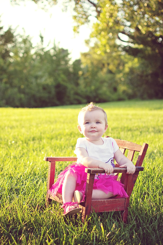
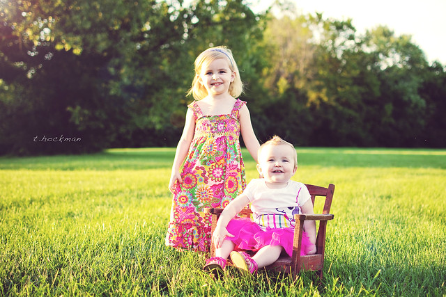
Kensley | 1 Year (Teaser) by taylorhockman, on Flickr
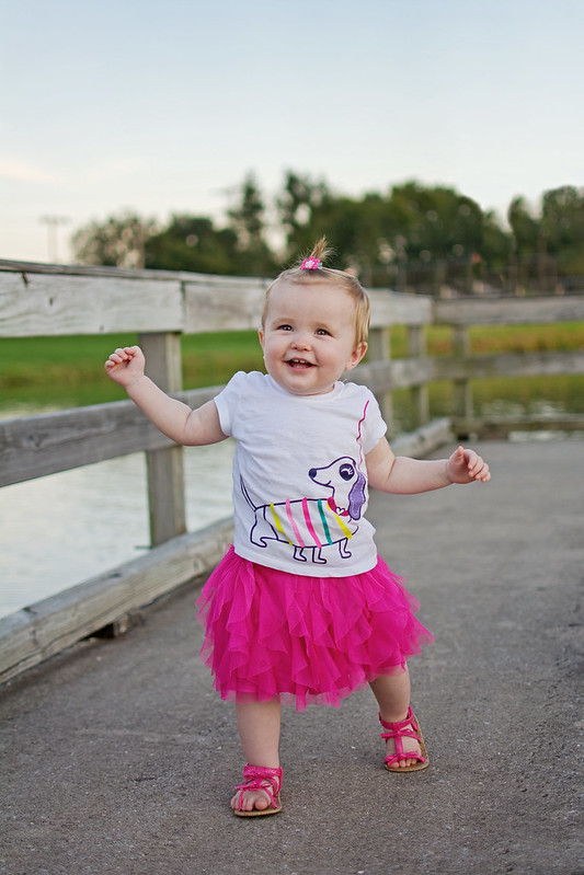
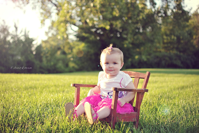
Kensley | One Year (Teaser2) by taylorhockman, on Flickr
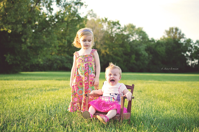
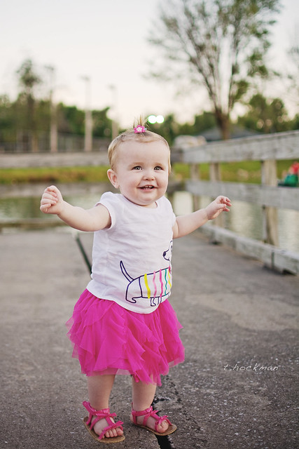
Kensley | One Year (Teaser3) by taylorhockman, on Flickr
 

Krs_2007

Senior Member
Really cute and for the shadows you could use a flash if you have one set to low power for fill. The colors look good and so does the composition, I think the 3rd is a little tight on the bottom as you almost cut off her feet.

So outside what you have already identified you did a really good job and I like the way you processed them.

With that said, I have seen this matte look so much that it has me really curious to what all is being done to achieve this. So if you get time maybe one day elaborate how you achieved this to help others.

I really like the first two and they would be really better with a little bit of fill light, if not a flash then a reflector would have worked.

Keep it up
 

WayneF

Senior Member
She couldn't meet me until 7pm so we didn't get a lot of light. I realize the light I did get is a bit off putting with the angle (shadows on the face) but I did my best to make up for it in post. We had turned the chair a tad more toward the sun but the girls were to squinty lol.


Cute pictures, but 7 PM was your best asset here, better light. The third one appears to be a bit later (or at least in shade), and is better light. Fill flash (and then a bit less ambient exposure) could help the first two.
 

TaylorGT

Senior Member
Really cute and for the shadows you could use a flash if you have one set to low power for fill. The colors look good and so does the composition, I think the 3rd is a little tight on the bottom as you almost cut off her feet.

So outside what you have already identified you did a really good job and I like the way you processed them.

With that said, I have seen this matte look so much that it has me really curious to what all is being done to achieve this. So if you get time maybe one day elaborate how you achieved this to help others.

I really like the first two and they would be really better with a little bit of fill light, if not a flash then a reflector would have worked.

Keep it up

Thank you for the input! I love the feedback, even when I've already identified it. Helps me know I'm analyzing my photos in the right way when other talented folks see the same thing. I just recently switched over to Nikon from Canon so my gear is a bit thin. I don't own a flash just yet and knew right away I needed it. I didn't even think about the reflector, I use them all the time for cars and probably had one under the seat in my truck during this shoot. Doh! I think I have a few more quality shots from the set that looks like that 3rd photo. I might need to go see if there's one that's a bit less tightly framed. She's just started walking recently so she was moving towards me fast and I was using a prime. I was trying to stay close to her just in fear that she'd wonder left/right to the edge of the dock and I didn't want to be responsible for that. I'll upload another one tonight.

As for the style, I am by no means a gifted Photoshop user. I got a an old copy of CS4 from a friend who upgraded when CS5 came out. I've spent 3 or 4 years dabbling with edits. Here are the layers I use (trying to replicate the layers control in CS4):

The layers/edit layers with the asterisks are the ones I would say probably contribute most to the "matte" processing you are wondering about. The rest of the layers are mainly for warming/film styling.


--Vibrancy
--Exposure (Exposure +1/3 stop, OffSet + .497, Gamma .95, Layer Set to 50% Opacity) *****
--Photo Filter
--Color Balance 2
--Color Balance 1
--Curves 2
Background Copy 2 (Layer Set to "Multiply" ) *****
--Curves 1 (RGB Modified) (See Attachment for Example) *****
Background Copy 1
Backround Layer (Locked)
 

Attachments

  • Curves Base.png
    Curves Base.png
    4.9 KB · Views: 79

TaylorGT

Senior Member
Cute pictures, but 7 PM was your best asset here, better light. The third one appears to be a bit later (or at least in shade), and is better light. Fill flash (and then a bit less ambient exposure) could help the first two.

Yep the 3rd one was a lot of processing or more than I had hoped for. It was probably taken about 10 minutes after we lost the sun behind the trees to the west.

I think its time to put a flash unit on my list for my D7100 :p
 

ShootRaw

Senior Member
Processing looks great..But on the first 2 pics try to follow the rules of thirds for your composition..3rd pic could use some cropping out of so much negative space above...
 

ShootRaw

Senior Member
I stand by my composition statements...Would be more interesting for subjects not to be in center..Still a lot of negative space overhead on your shots..
 

SkvLTD

Senior Member
I need to look more into portrait 'shopping, but what's the point of stacking layers for effects instead of applying/doing everything with the original since you're not really doing anything to separate the subject from the background?
 

TaylorGT

Senior Member
I stand by my composition statements...Would be more interesting for subjects not to be in center..Still a lot of negative space overhead on your shots..

I agree with you about the negative space. Again, this is a result of the majority of my photography work being in the automotive industry. I often shoot wider and can crop later on in post. Same applies here, I have cropped versions of some of these with much less open space.

I am always aware of the rule of thirds. But I don't force it into every photo. Some of the ones above that I would normally have made sure to align better, were done just out of ease. Like I said she is on the move, walking for the first time in a lot of the standing photos. Much easier for me to hit center point and move with her. Keep i mind I was not glued to my viewfinder because I was making sure she didn't stray to the edge of the dock.

I need to look more into portrait 'shopping, but what's the point of stacking layers for effects instead of applying/doing everything with the original since you're not really doing anything to separate the subject from the background?

You're probably asking the wrong person, hopefully someone else here can respond because if there is an easier way I'd like to know. I stack layers for auto photos, especially when shooting a dark car at sunset etc. I often edit the subject/bg differently. So I'm just used to working that way. I have table setting actions that setup my layers and stacks.
 
Top