You are using an out of date browser. It may not display this or other websites correctly.
You should upgrade or use an alternative browser.
You should upgrade or use an alternative browser.
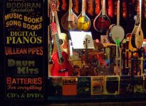
Which photo d'ya like better?
- Thread starter Greywoulf
- Start date
Joseph Bautsch
New member
I would have to agree with jdeg and say the first one. It's a bit brighter with better contrast. I really like the color and play of shadows about the instruments. The DOF is good. I would try to something about the over exposed sheet music in the center. The white spot is distracting. The first thing the eye is drawn to are highlights. Maybe you can use some post processing to bring out the music printed on the sheet. My suggestion and if I were taking the shot I would zero in on the sheet music and frame it so there are the instruments around it. The sheet music is in landscape format framing it that way would probably work best. There is a lot of great color with a lot of shadows playing about the instruments and on the sheet music. The neck of the violin with its tuning knobs break up the rectangular lines of the sheet music and adds interest and supports the whole composition. I would also get my wife or girlfriend to stand off to the side so her reflection shows in the glass over the music sheet. I think that would add a human touch and interest.
I would have to agree with jdeg and say the first one. It's a bit brighter with better contrast. I really like the color and play of shadows about the instruments. The DOF is good. I would try to something about the over exposed sheet music in the center. The white spot is distracting. The first thing the eye is drawn to are highlights. Maybe you can use some post processing to bring out the music printed on the sheet. My suggestion and if I were taking the shot I would zero in on the sheet music and frame it so there are the instruments around it. The sheet music is in landscape format framing it that way would probably work best. There is a lot of great color with a lot of shadows playing about the instruments and on the sheet music. The neck of the violin with its tuning knobs break up the rectangular lines of the sheet music and adds interest and supports the whole composition. I would also get my wife or girlfriend to stand off to the side so her reflection shows in the glass over the music sheet. I think that would add a human touch and interest.
Which is sort of why I like the second one better myself... The highlights and the noise are not as prominent, and the instruments and the sign do not ~glare~ out at you as brightly... Also I feel that the brighter sign's writing is distracting from the warm instrument details?
This photo was actually taken late at night in Killarney as I stood outside the music store, and I think the second photo carries more of that look while the first looks more like a magazine ad to me..?
Actually the second photo has been PP'd some also; -in the original pic the sign was so dark you could barely read it. Also I have already darkened the highlights in it and have increased the contrast a bit too... So I don't want to do much more PP with it, as it then begins to lose some quality, IMO.
With my photos I guess I'm more interested in carrying forward a mood rather than always adjusting for more technical improvements, so I think I will probably stick with the second version... However I'm very grateful for all your opinions, as they are helping me to determine and recognize my own slowly forming concepts of photography... ">})
I have another shot of this store from a different angle; I think I'll post some more before/after pics of that one too after I put it thru PSE 6.0.........
Last edited:
Essence of Imagery
New member
Honestly, they're both very nice versions. I believe that they both have their place - dependent completely on the decor surrounding the print. I can picture this in a brightly lit soul food restaurant, where the walls are colorful, and filled with this style of art work. There I would most definitely use the brighter version, as it would be competing for the attention from the surrounding decor - and would need to stand out. On the other hand, in a dimly lit, more coffee-house meets lounge atmosphere, I'd use the more subdued tones and colors of the second image. I've found that in my experience (in displaying art in restaurants and other venues) I will create a different version depending on the atmosphere surrounding the artwork. Perhaps this isn't the answer you're looking for, but it's just another point of view.
RamblingDude
New member
I really like the more vivid version. The eye-confusion is an essential aspect iof the subject. The sheet music is, admittedly a problem. Perhaps even photoshop it out altogether. No reflected model in the window! That would get in the way of free-falling into the image.
P.S.
I see another shot!
A narrow vertical, the full vertical, and horizontally from the left edge to the right edge of the fingerboard on he yellow guitarThat signage really works and needs emphasis.
 How to emphasize while maintaining visual subtlety????
P.S.
I see another shot!
A narrow vertical, the full vertical, and horizontally from the left edge to the right edge of the fingerboard on he yellow guitarThat signage really works and needs emphasis.


